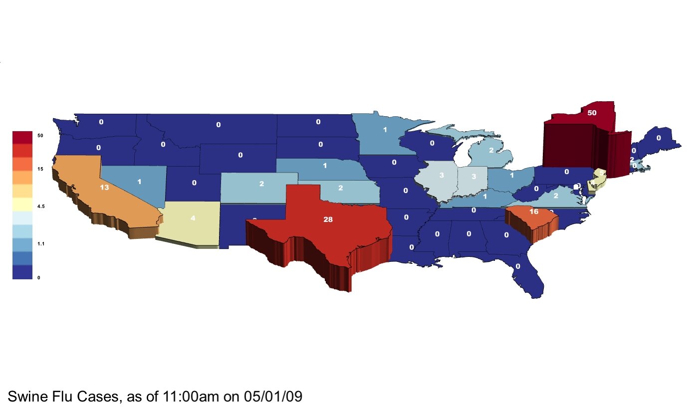
Swine Flu 5/1/09 — With Change in Cases from 4/30/09
May 1st, 2009 by Zach Wilson
Hi. We’ll update this post as new numbers become available — this is the second post.
Our data is from the CDC : http://www.cdc.gov/swineflu/
Please let us know if you see new numbers before we do. Thanks!

Note: Colors by log scale.
And, here is a video, showing the change in reported cases from 4/30….
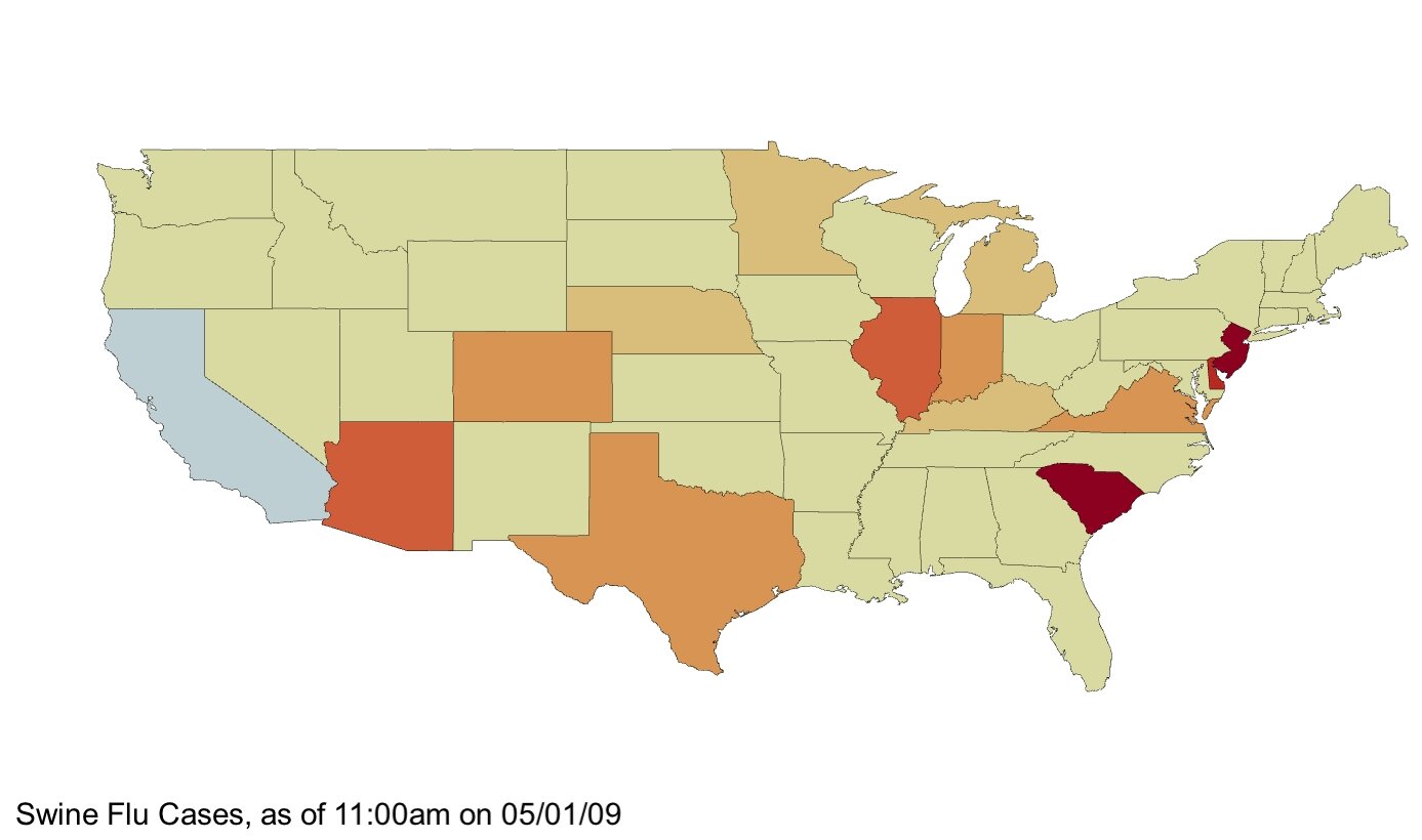
And below we can take a look at rates of change by color, with Red as highest growth rate, and Blue as the lowest. In many cases, the number of cases is very small, and since this number is used as the denominator in calculating rate of change, some states with relatively high rates of change have very few actual cases. It may be useful to compare the map below to the top map to assess which states have relatively high numbers of cases and relatively high growth rates. Also worth noting is that none of these numbers have been placed in the context of other public health numbers. For example, if these maps were scaled relative to regular flu cases, it would be very difficult to see any swine flu cases or rates of growth. Nonetheless, if the CDC regards these Swine Flu cases as an important trend to watch, maybe these maps are useful without needing broader context. Comments?

Colors above show rate of change from 4/30, with dark red indicating a growth rate of greater than .1 and pale yellow showing no growth.