Company Blog

Archive for the ‘All’ Category

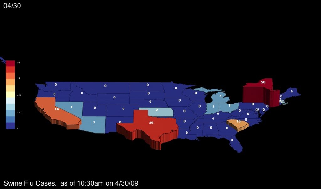
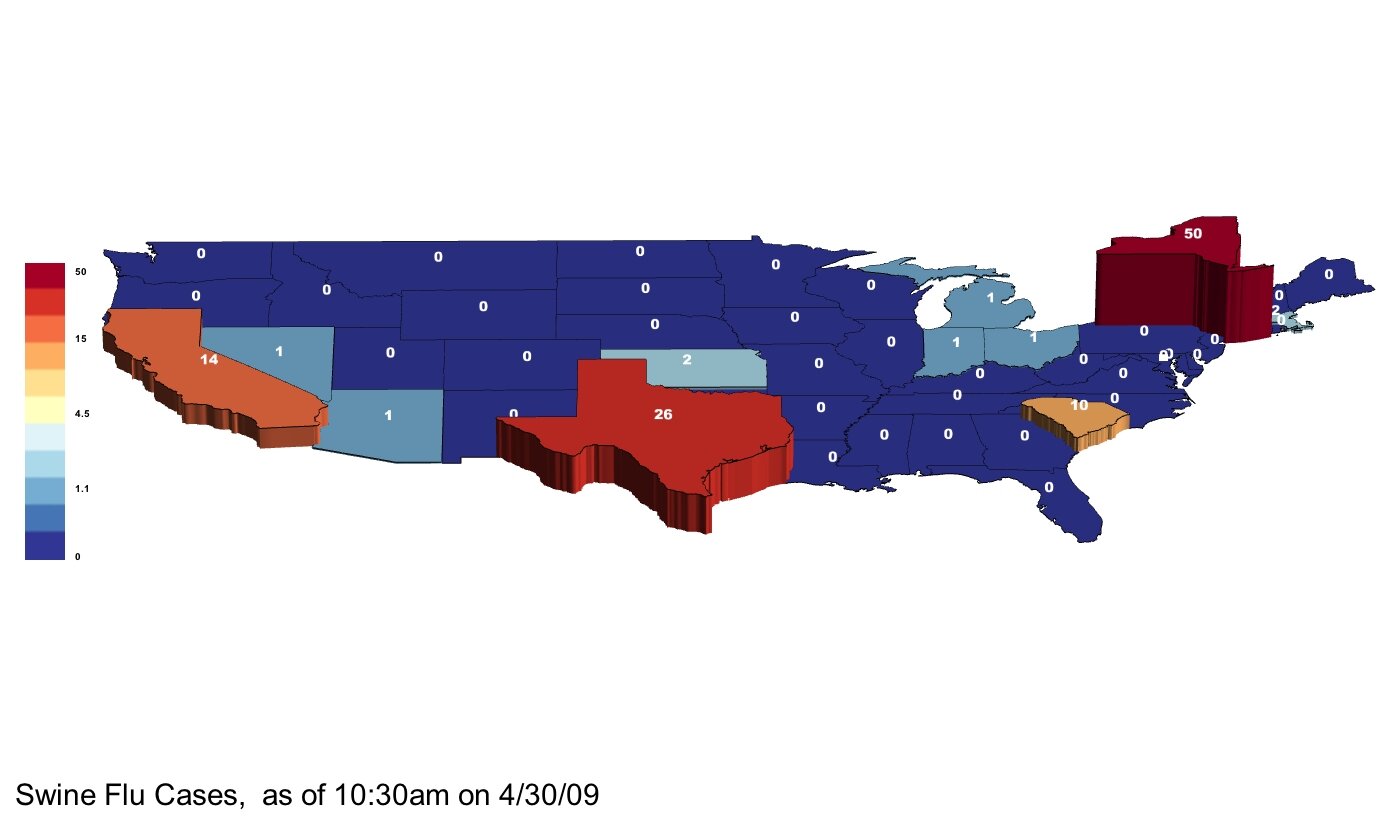
Map of Swine Flu Cases — CDC Reported, 10:30am on 4/30/09

April 30th, 2009 by Zach Wilson

Hi.  We’ll update this post as new numbers become available.

Our data is from the CDC : http://www.cdc.gov/swineflu/

Please let us know if you see new numbers before we do.  Thanks!

note: colors by log scale

Map backgrounds are provided in both black and white in case you want to post them anywhere else. If you want to adjust colors, scale, view angle or other details, please use our software, which can be downloaded in a free version from our main page.

Please note, colors are by logarithmic scale.

Please note, colors are by logarithmic scale.

US Unemployment in 2009 - More Job Losses in Production

March 9th, 2009 by George Maasry

In an Economic News Release on Friday, the Bureau of Labor Statistics published their latest unemployment figures, covering the first two months of 20091. Not that it comes as a surprise to anyone, but it was more bad news: more unemployment in virtually every sector of US industry.

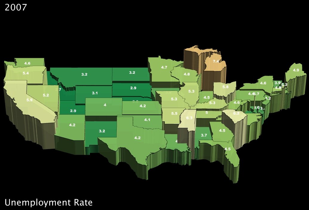
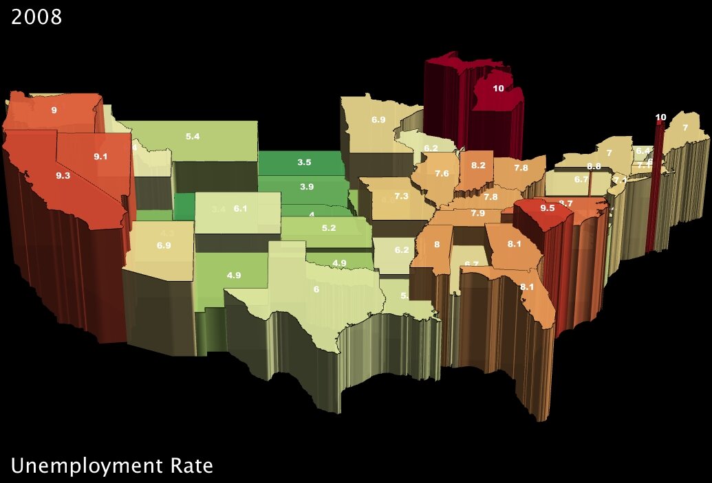
Unemployment Rate by State in 2007 Unemployment Rate by State in 2008
Unemployment Rate by State in 2007 (click to enlarge) Unemployment Rate by State in 2008 (click to enlarge)

The overall negative trend is not consistent across sectors, however. While a few areas have managed to stop hemorrhaging workers, others are proportionally hit so hard that another 3 percent of the entire workforce lost their jobs between December and February of this year. Specifically, the goods-producing sectors (generally construction and manufacturing) are still suffering massive job losses each month; professional and business services were hardest hit by sheer numbers, with 180,000 jobs lost in February; and by contrast, some of the other services-providing sectors have slowed their losses considerably. A minority of services have even seen slight recovery, with government, education and health-sector jobs actually increasing marginally in January and February.

While professional and business services did suffer major losses this past month, the 180,000 jobs lost represent one percent of the national work force in that sector; meanwhile, the 168,000 jobs lost in manufacturing, which compound repeated one-percent-and-greater losses of the workforce the past several months, represent almost 1.5 percent of the work force of January.

To expose some of these differing trends, I took the figures for the last three recorded months — December of ‘08 and January and February of ‘09 — and rescaled them as percentage changes within the workforce for a given sector. I then plugged the data into IBM’s online visualization toolkit, “Many Eyes2,” to create the graph below. You can click the image to interact with it and look at my data (note: I couldn’t get the labels to appear without being clipped, so hover over a bar in the graph to get a complete view of the category name).

The disproportion between industries is striking, indeed. And since the graph is showing percentage change in employment figures, the compounded effect of a dwindling labor force month by month makes each job lost in goods-producing industries count further. It should be noted that in addition, not only are construction and manufacturing establishments shedding employees, but they are also reducing the number of hours on average that their employees are at work, which in turn reduces their wages. According to the BLS’s numbers, the average hours of work reported in manufacturing jobs for December, January and February gradually declined from 39.9 to 39.8 to 39.6 hours1, despite steady averages across all sectors.

Taking a closer look at manufacturing…

As UUorld sends its employees between Silicon Valley and Washington DC — areas primarily involved in technology and government, respectively — the immediate effects of failing manufacturing are not always obvious in my everyday experience. Clearly, however, there are parts of the country that rely heavily on manufacturing. I thought it would be useful to include some analysis of regional patterns as the unemployment crisis has affected them.

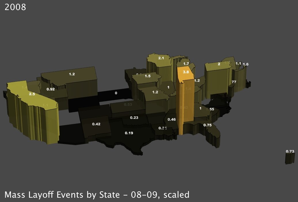
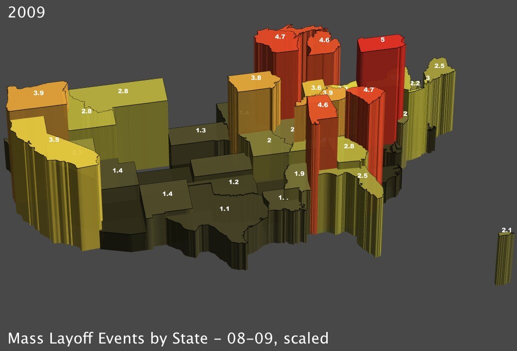
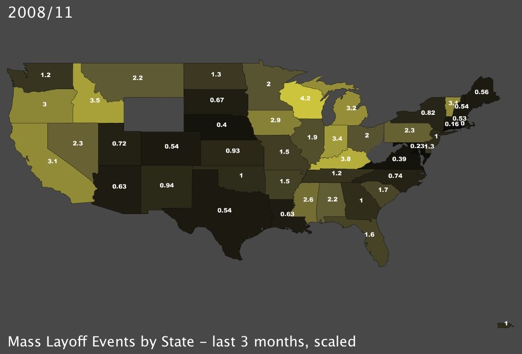
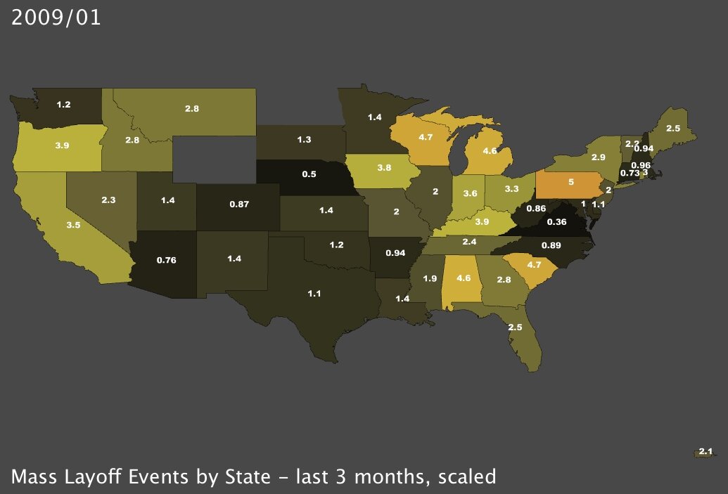
I started by mapping recorded instances of new unemployment, in the form of mass layoff events, measured whenever a company has at least 50 initial claims for unemployment insurance (UI) filed against it during a 5-week period3. The most recent data being the records for January of 2009, I decided to contrast that data with the same measures for January of 2008. The regional trends are immediately identifiable:

Mass Layoff Events by State in January 2008 Mass Layoff Events by State in January 2009
Mass Layoff Events by State, January 20084 (click to enlarge) Mass Layoff Events by State, January 2009 (click to enlarge)

I’ve scaled the data by dividing each state’s number of recorded mass layoffs by every 100,000 members of its labor force. So, for instance in the upper-right image above, Michigan had 4.6 mass layoffs reported for every 100,000 workers in the state this past January. With a total labor force of about 4.9 million, that means that more than 220 mass layoffs occurred in January alone — more than seven per day.

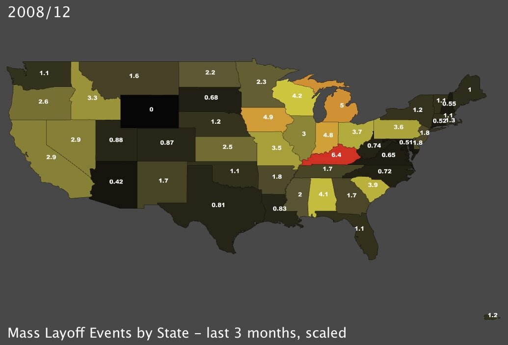
To get an idea of the consistency of these layoffs, I’ve also generated maps for the last three recorded months. The data in the rightmost map below is identical to the January 2009 map above-right, but the colors are scaled relative to the other maps in the set of three. Because Kentucky suffered an enormous number of mass layoffs in December of 2008 (middle map) which surpasses all other measures, there is some diminution of the high values in January 2009. Given that these recordings are separate from month to month, it is all the more shocking to realize that the effects are cumulative. In other words, while Kentucky suffered 6.4 mass layoffs per 100,000 workers in December, the trend didn’t reverse itself in January, which saw the state suffer another 3.9 mass layoffs per 100,000.

Mass Layoff Events by State in November 2008 Mass Layoff Events by State in December 2008 Mass Layoff Events by State in January 2009
Mass Layoff Events, November ‘08 (click to enlarge) Mass Layoff Events, December ‘08 (click to enlarge) Mass Layoff Events, January ‘09 (click to enlarge)

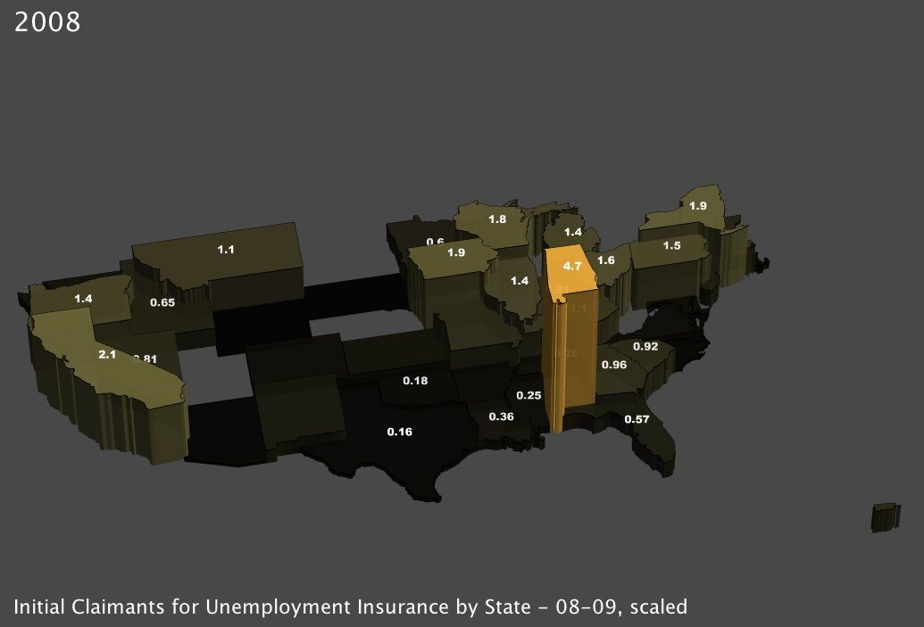
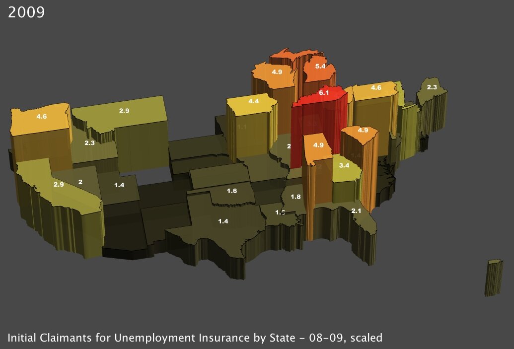
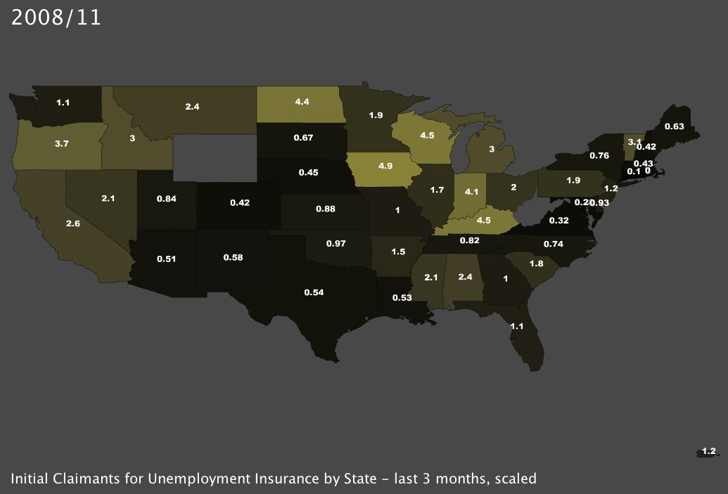
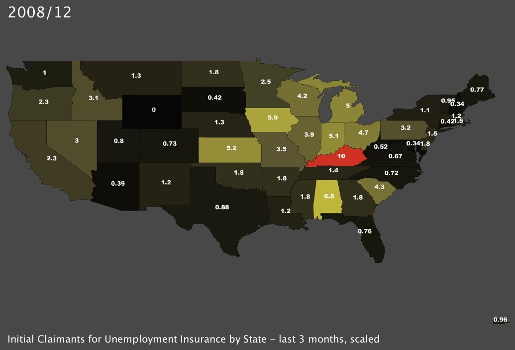
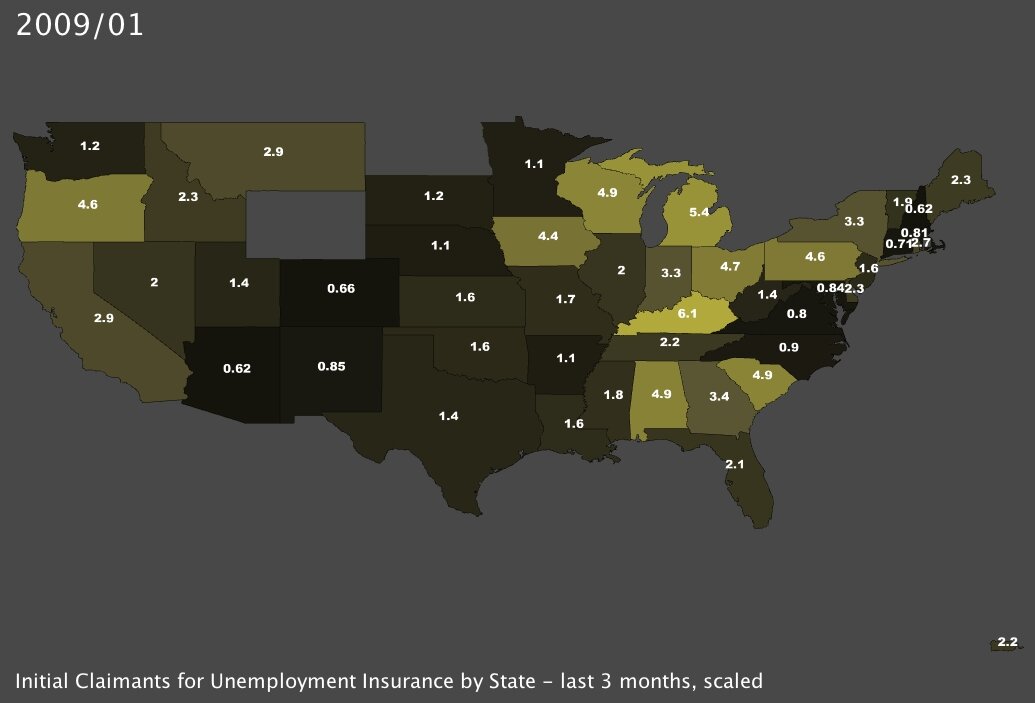
I also made some maps based on the actual total number of claimants3 for UI in a given period of time. The regional patterns are similar, and the rate of new unemployment seems consistent across both time periods as well (the January-to-January comparison and the month-by-month comparison). In this case I scaled the data by dividing by every 1000 members of the labor force; so for example Kentucky saw 10 of every 1000 workers file for unemployment insurance in December of 2008 (the middle small map below).

Initial Claimants for Unemployment Insurance in January 2008 Initial Claimants for Unemployment Insurance in January 2009
Initial Claimants for Unemployment Insurance, January 2008 (click to enlarge) Initial Claimants for Unemployment Insurance, January 2009 (click to enlarge)
Initial Claimants for Unemployment Insurance in November 2008 Initial Claimants for Unemployment Insurance in December 2008 Initial Claimants for Unemployment Insurance in January 2009
Claimants for UI, November 08 (click to enlarge) Claimants for UI, December 08 (click to enlarge) Claimants for UI, January 09 (click to enlarge)

Across all of the maps, it is obvious that some states are much harder hit than others. In particular, the Great Lakes states and many of those in the Southeast are the worst off. And that is logical, given the recent data published by BLS: many, if not most, of the Great Lakes and Southeastern states rely heavily on manufacturing.

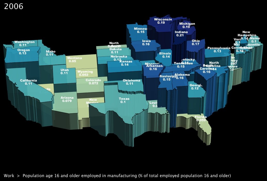
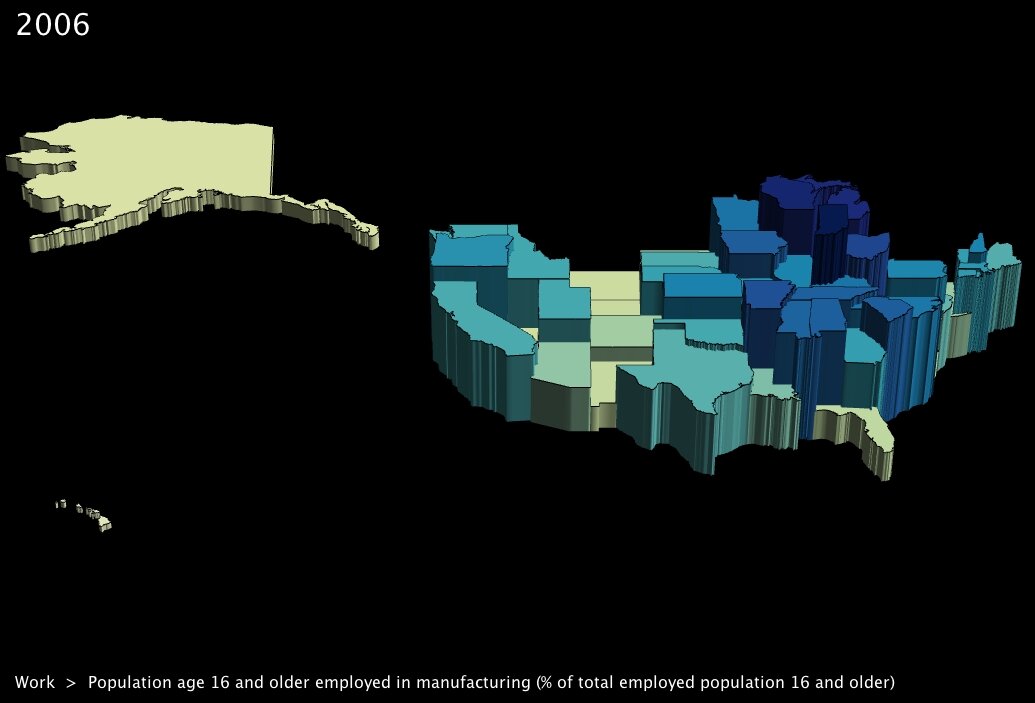
To go one step further, I took the most recent data from the Census Bureau’s American Community Survey5 to get some maps showing exactly which states were most reliant. Of course all of the hard-hit states show up in dark blue: Michigan, Ohio, Indiana and Wisconsin all see close to a fifth of their entire workforce employed in the sector.
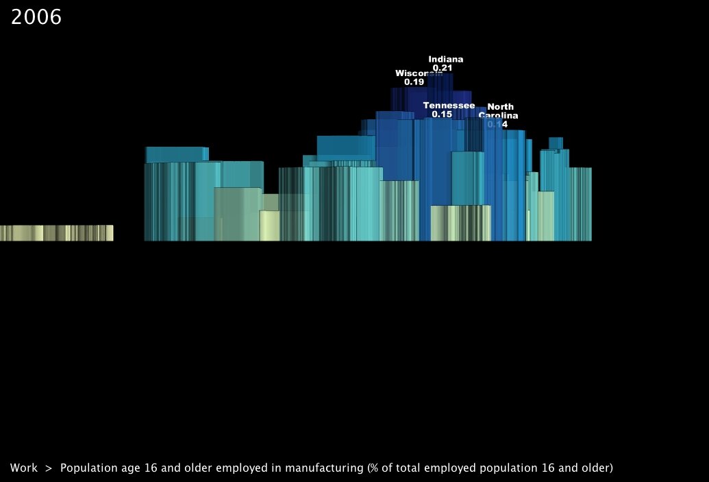
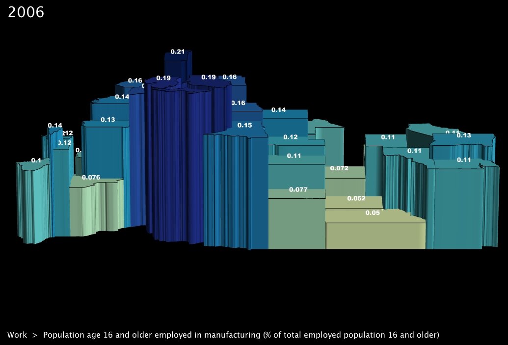
I took several snapshots from uncommon angles as well, shown in the small maps below. Looking south across the US, one can see how little
Work Force Population Employed in Manufacturing in 2006
% of Work Force Employed in Manufacturing, by State (click to enlarge)

of the Rocky Mountain states’ labor force is employed in manufacturing — which corresponds with their relative resistance to job losses in the past few months.

Percentage of Work Force Employed in Manufacturing, 2006 Percentage of Work Force Employed in Manufacturing, 2006 Percentage of Work Force Employed in Manufacturing, 2006
Claimants for UI, November 08 (click to enlarge) Claimants for UI, December 08 (click to enlarge) Claimants for UI, January 09 (click to enlarge)

What is perhaps surprising in all of this is that, unlike with the housing market or wall street traders, the idea of over-inflated prices self-correcting doesn’t really apply. The school of thought that we should welcome recession as a means of readjusting values to their appropriate levels is somewhat lost on an industry which has actually been in decline for several years running, and which was already suffering — albeit less severely — before the current recession hit.

But even if the recession didn’t cause the problems in manufacturing, it seems that tough economic times have exacerbated the problem. For states in the Rust Belt and states in general that rely heavily on goods-production, GDP has decreased for several years running, and the situation only seems to get worse with time. (Example: ).

Between 2003 and 2007, the three worst-performing states in GDP growth were Michigan, Indiana and Ohio, all vastly under the national levels (and even averaging recessive growth in the case of Michigan). Nonetheless, through the entire period about a quarter of the GDP generated by those states, and some of those in the Southeast (Kentucky, Louisiana, the Carolinas), has remained tied to the sector.
% of GDP Derived from Manufacturing, by State, 1997-2007 (click to play video)

Ultimately, is the solution an “industrial revolution,” as called for by some economists today? Or will the recession force the Great Lakes states and others to redistribute their workforce across other sectors? In any event, all appearances seem to indicate that further tough times lie ahead, and preliminary statistics show a further employment slide as we progress through this year. The BLS’s predictions for the years to come indicate similar trends: in their 10-year projections for industry sectors, a large majority of those listed as “most rapidly declining” are directly related to or are subsets of manufacturing6.

It will be interesting to see whether programs like the Obama Stimulus Package can at least slow down the job loss rates in the coming months. We will be watching the release of new statistics closely …


Footnotes:

1. Bureau of Labor Statistics. Economic News Release: employment situation summary for February, 2009.
2. research group. Many Eyes online data visualization tool.
3. Bureau of Labor Statistics. Mass layoff statistics program.
4. States that are missing from the maps did not provide data that meets the disclosure standards of either the BLS or local state agency. BLS confidentiality standards.
5. US Census Bureau. American Community Survey. Data available at: UUorld Data Portal.
6. Bureau of Labor Statistics. Employment projections.

UUorld on Twitter

February 11th, 2009 by Willy Pell

You can now follow on Twitter here:

We will be posting development progress and participating in a general conversation about the direction of the product. Jump in!

The Obama Stimulus Package, State by State

February 10th, 2009 by George Maasry

The “American Recovery and Reinvestment Plan1,” as christened by President Obama, is meant to channel funds into areas critical to both the short- and long-term health of the US economy. Amidst online discussions of the plan, I came across a series of interesting articles on National Public Radio’s blog, in a section dedicated to economics called “Planet Money.”
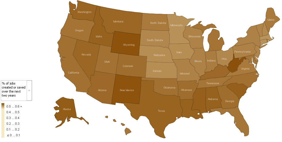
2D Map of Stimulus Package Effects by State (by Alan Cordova) These articles, authored by Alan Cordova2, analyze five elements of the stimulus package, based on estimates released by the White House3 last week. Mr. Cordova did a bit of data crunching with other US-government datasets, which I’ve emulated (household counts and employment figures from the Census Bureau)4, and produced some flat maps to
Alan Cordova’s map on Job Creation - click to enlarge

show which states would be most affected by each part of the stimulus package. He used IBM’s online visualization generator5, “Many Eyes,” to create the maps; incidentally, Many Eyes is part of what IBM calls its “Collaborative User Experience” project, and is a nifty interface to create some simple, incisive visualizations. But I digress.

Mr. Cordova’s post piqued my curiosity, and gave me a hankering to actually interact with the numbers myself; so, I reproduced his data and imported it into UUorld. To get spending numbers for individual states, I drew from the memo released by White House economic advisor Brian Deese last week. You can find that memo here.

The memo breaks benefits into five areas, in accordance with new programs; I thought I’d use the same. At first I played around with the sensitivity and ground-level values in UUorld for a bit so that each variable would display with a complete range of colors (I found it hard to differentiate between states in some of the brown 2D maps). In so doing, I came across an array of patterns I wasn’t aware of at first take:

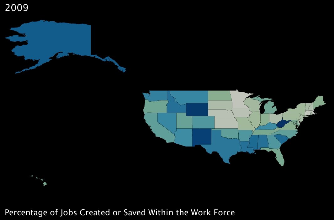
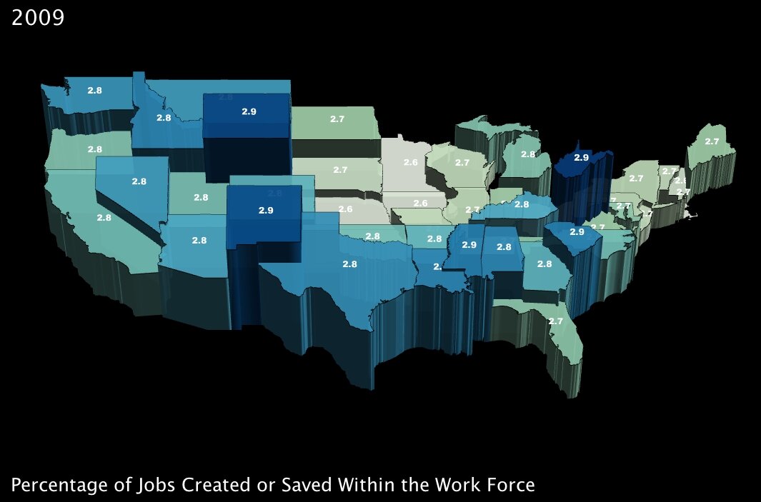
1. The number of jobs projected to be created or saved over the next two years, as a percentage of total employment in a state. (click images to enlarge)

Percentage of Jobs Created or Saved with the Obama Stimulus Package, by State Percentage of Jobs Created or Saved with the Obama Stimulus Package, by State (3D)

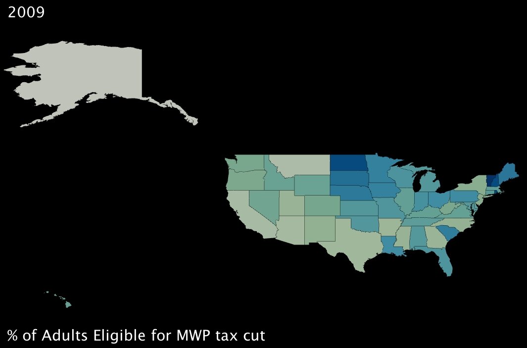
2. The percentage of working-age adults eligible to receive a “Making Work Pay” tax cut of up to $1000. (click images to enlarge)

Percentage of Adults Eligible for the Making Work Pay tax cut, by State Percentage of Adults Eligible for the Making Work Pay tax cut, by State (3D)

These first two variables measure benefits that will, in theory, directly combat poverty. The first is of course job creation; the second translates to fiscal support for working adults who are below the poverty line — it’s a basic extension of the Earned Income Tax Credit6 (established under Ford, one of the rare domestic fiscal-policy creations that has garnered support from both political parties).

Interestingly, the two benefits seem to complement each other almost perfectly; in states where fewer jobs will be created by percentage, almost without exception, more families are supported by the tax credit. Also interestingly, a few southern states in particular — Lousiana, Alabama and South Carolina (and to an extent Kentucky) — will reap significant benefits from both parts of the program. These states are among the poorest in the Union (all in the bottom 10 by income)7, so at first glance, the added support seems well placed.

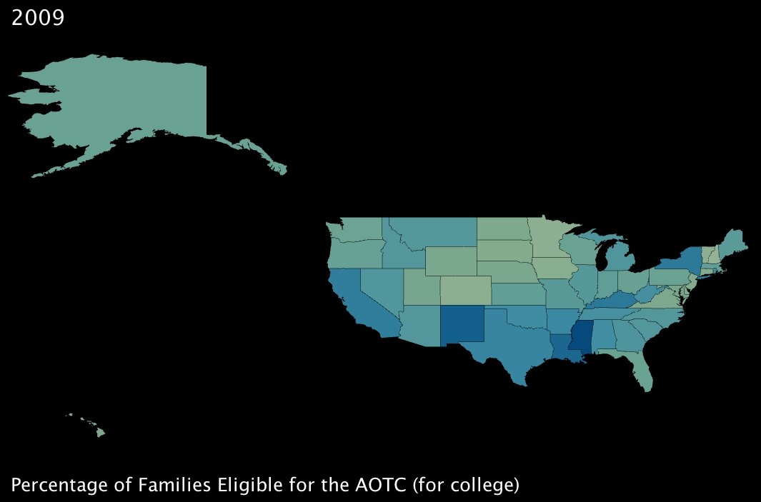
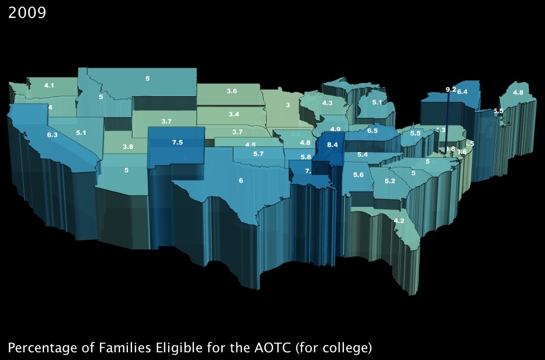
3. The percentage of families that will become eligible for government aid called the American Opportunity Tax Credit, which is geared specifically towards making college affordable for poorer families. (click images to enlarge)

Percentage of Families Eligible for the American Opportunity Tax Credit, by State Percentage of Families Eligible for the American Opportunity Tax Credit, by State (3D)
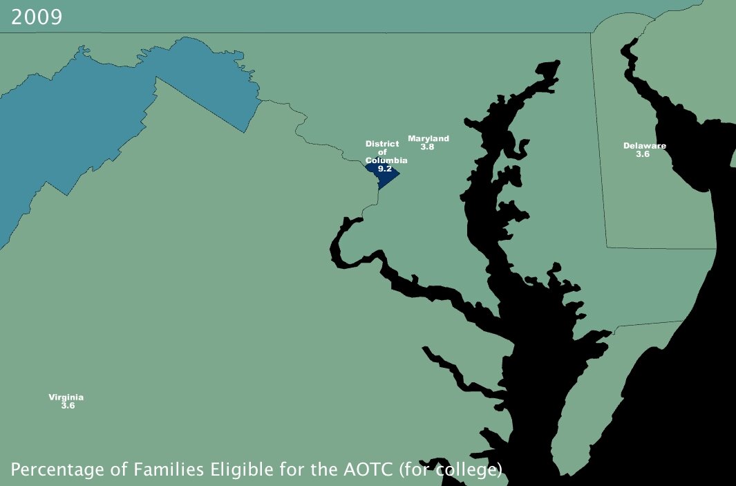
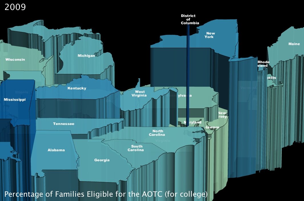
Percentage of Families Eligible for the American Opportunity Tax Credit, near Washington DC, by State Percentage of Families Eligible for the American Opportunity Tax Credit, near Washington DC, by State (3D)

The AOTC is meant to eliminate around two-thirds of college costs for families in need by furnishing a $4000 tax credit in exchange for 100 hours of community service performed by the candidate8.

It immediately jumped out at me that Washington DC, at 9.2% of families eligible, has about twice the number of possible candidates by percentage than most of the rest of the states in the Union. Conventional “wisdom” would hazard me to guess that this is because even though the District is not the poorest state — actually by per capita income it ranks as high as 16th7 — its population is severely divided economically. Note to self: look into statistics on that for a future post.

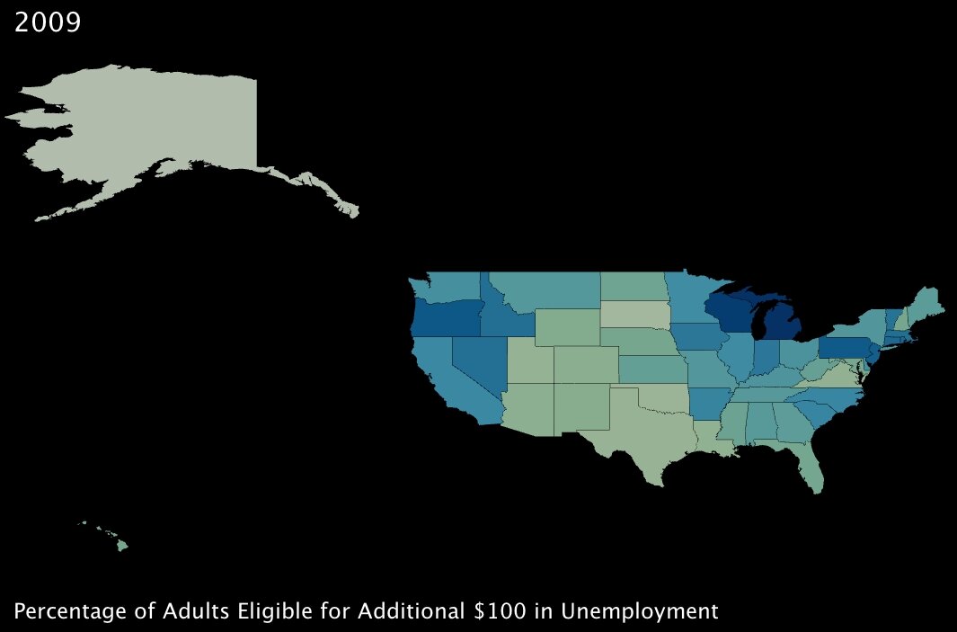
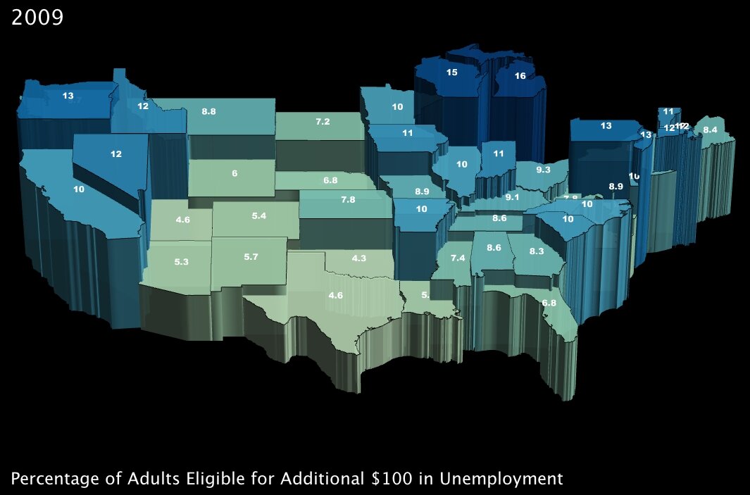
4. The percentage of working-age adults eligible to receive an additional $100 per month in unemployment insurance benefits. (click images to enlarge)

Percentage of Adults Eligible for $100 in Additional Unemployment Insurance, by State Percentage of Adults Eligible for $100 in Additional Unemployment Insurance, by State (3D)

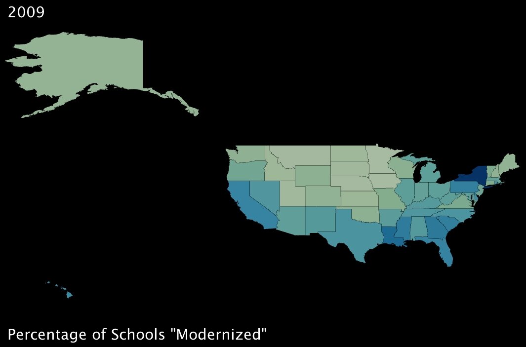
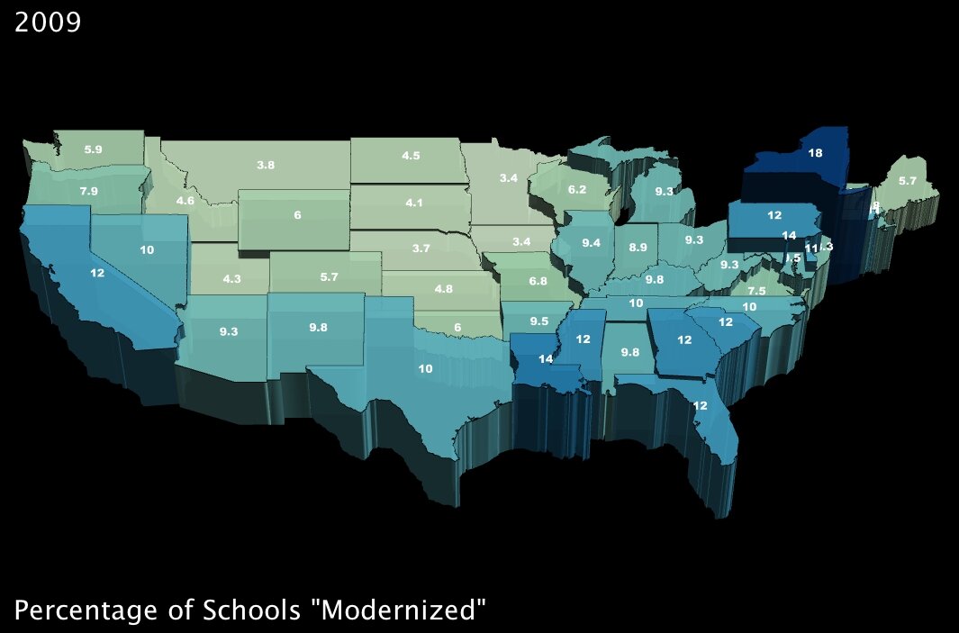
5. The percentage of schools that will undergo so-called “modernization.” (click images to enlarge)

Percentage of Schools that will Undergo Modernization, by State Percentage of Schools that will Undergo Modernization, by State (3D)

Between these two measures, again it looks like benefits are well distributed around the country. While the additional unemployment credit will have greater effect in the northern states, it seems that southern states will benefit more from the school “modernization” project9 encapsulated within the stimulus plan.

When I started working with this data, my intention was to determine whether certain states were favored by the stimulus package (by measure of these variables, anyway). As it turned out, interestingly, the benefits seem to be more or less evenly distributed across the country … and while that may be a positive sign for the plan itself, it doesn’t do much to answer my question.

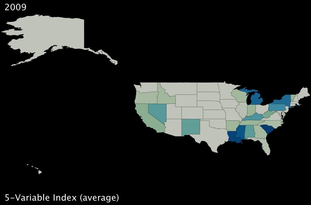
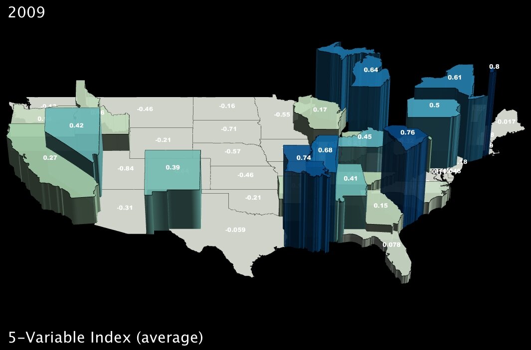
To dig a bit deeper, I took standard deviations and calculated z-scores10 for all five variables; then I created a new index variable by taking the average z-score for each state. Here are the results:

5-Variable Index (average z-score) 5-Variable Index (average z-score, in 3D)

The states in darker blue (and elevated in the second image) are the ones most positively affected, in the aggregate, by the five benefits of the stimulus package as originally delineated by the Deese memo.

It bears noting that Alaska ranks dead last, receiving the fewest benefits on average as measured by our given variables. However, it would be hard to argue that Obama is using the stimulus package to play favorites, at least on a state-wide level, given that his home state of Hawaii is quite far down the list as well (about two-thirds of the states fare better than Hawaii using this index).
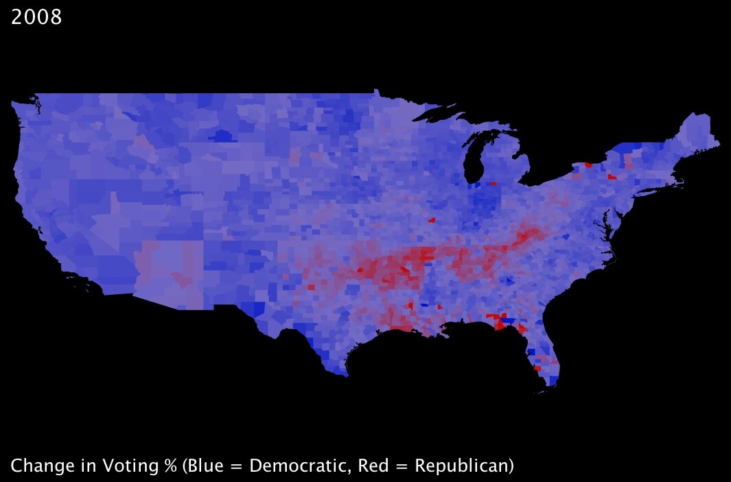
2008 Election - Change in Voting Percentages from Republican to Democrat Back during the immediate aftermath of the election, I looked at a range of statistics comparing voting trends — and my colleagues and I wrote some blog posts about those trends. Most notable, to my mind, is that almost without exception the country voted more democratically — that is, more in favor of Obama — than it had four years prior; this held true for even most states that are typically staunchly Republican. While the state may still have gone to John McCain in 2008, the overall

percentage of Democratic votes often dramatically increased from the Bush-Kerry election of 2004. The one exception to this was a strong tendency towards more Republican voting within a band spanning one of the poorest parts of the country: namely, the mouth of the Mississippi River in Mississippi and Louisiana, stretching up through Arkansas, and across Tennessee into Kentucky and West Virginia.

As I was familiar with this trend, I was surprised to note that the stimulus-plan index I created seems to show those same states are for the most part going to benefit proportionally more than many of their peers. Somewhat ironic, perhaps … or could the stimulus plan intentionally favor those constituents with whom Obama is currently least popular? To assert the numerical validity of that assumption, I pitted state-level election results (percentage of the vote won by the Democrats) against the 5-variable index by testing for statistical correlation11. The result was a correlation coefficient of 0.166, meaning that if anything there is a slight tendency for those states that voted for Obama to benefit more from the plan.

While 0.166 is not a strong correlation indicator either way, it does represent the strength of all five variables, averaged. As I had already found out, the benefits of each part of the plan are spread across the country in different proportions. Thus, I also tested for correlation between voting results and the 5 variables individually:

ALL. Five-Variable Index and % of 2008 Obama Votes: Correlation Coefficient = 0.1658 [small positive correlation]
1. Job Creation and % of 2008 Obama Votes: Correlation Coefficient = -0.6336 [large negative correlation]
2. Adults with MWP and % of 2008 Obama Votes: Correlation Coefficient = 0.1162 [small positive correlation]
3. Families with AOTC and % of 2008 Obama Votes: Correlation Coefficient = 0.1240 [small positive correlation]
4. $100 Benefits and % of 2008 Obama Votes: Correlation Coefficient = 0.3741 [positive correlation]
5. Schools Modernization and % of 2008 Obama Votes: Correlation Coefficient = 0.3721 [positive correlation]

This seems to indicate that the job creation forecasted by the White House tends strongly to states that voted against Obama. What the exact measures are to be taken to create those jobs is somewhat unclear, but that Republican-voting states are the predicted beneficiaries is striking.

Of course, correlation is not at all the same thing as causation. I remain wary that the demographic and economic differences that render certain parts of the country susceptible to one element of the stimulus package may be unrelated to whatever factors underpin ideological tendencies in a given direction.

As always, UUorld has helped me explore my questions, answer them, and then find many more.


Footnotes:

1. Wikipedia America Recovery and Reinvestment Plan.
2. Alan Cordova is a writer for “Planet Money” at National Public Radio. .
3. Boston Herald. “White House estimates new jobs in stimulus plan” by the Associated Press.
4. American Community Survey. The US Census Bureau’s 2006 tally of households by state; and American Community Survey. The US Census Bureau’s 2006 count of total employed adults by state.
5. research group. Many Eyes online data visualization tool.
6. Internal Revenue Service. Earned Income Tax Credit definition, questions and answers.
7. Wikipedia States of the US by Income.
8. . American Opportunity Tax Credit - Definition and Overview.
9. National Clearinghouse for Educational Facilities. Federal funding stimulus for school facilities: description and comparison of bills.
10. Wikipedia Standard score. Standard deviations were calculated like this: The differences between each value and the mean value are squared, summed, and then divided by the total number of measurements.
11. .
Reading Maps, According to Cognitive Science

February 4th, 2009 by George Maasry

I recently read a post on Cognitive Daily entitled “Reading graphs — How we do it, and what it tells us about making better ones.” The post exposed the research performed by cognitive scientist Raj Ratwani1, with the goal of tracking eye movements of respondents analyzing a basic population density map.
The inferences were fascinating, and reinforce many of the concepts that have inspired our work here at UUorld. In a nutshell, when posed questions that required analysis (rather than simple observation), respondents were stymied by disparate elements of the presentation: a four-level color scheme and cryptic legend essentially forced them to absorb the data in several steps, processing each step one after the other. The study found that respondents first had to “integrate the graph visually — that is, determine which cluster goes with which data. Then, [they had to] cognitively integrate — figure out the relationship between the clusters.”

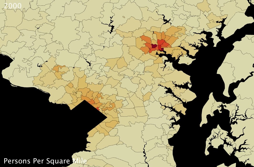
maryland counties population density 1
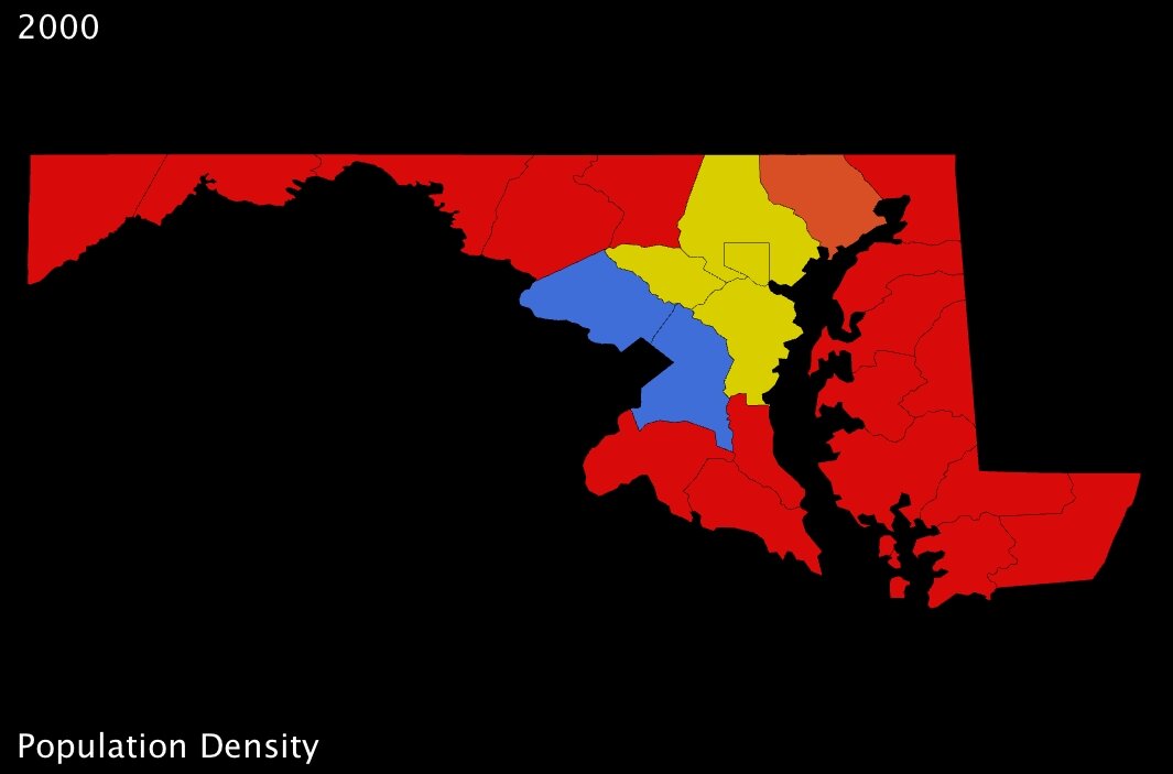
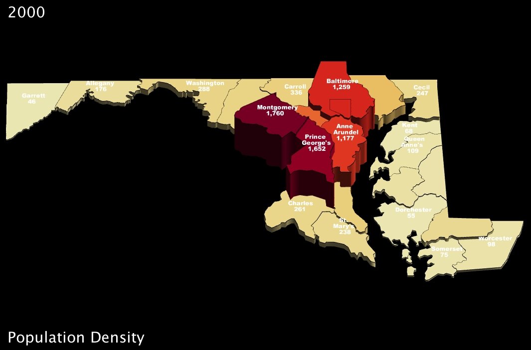
Maryland counties population density in 2000 (US Census Bureau) - click to enlarge

Ratwani and his crew used maps very similar to the one I’ve put together here (above). While they used a fictional state, they distributed the counties across it such that obvious “bands” of higher and lower population density were immediately apparent. In my map here, I’ve chosen Maryland because its counties are distributed in a similar fashion. Immediately, we can see that a 4-color spectrum is useless when it comes to differentiating most of the counties in the state.

Of course, making information clearer through maps is basically UUorld’s mission statement, and so I jumped on the opportunity to use our visualization engine to improve upon the Maryland map, and counter the array of “tough spots” exposed by Ratwani’s research.

For starters, much of the difficulty respondents had with the simple density maps came from shifting focus between legend and map, because the map itself failed to convey information on its own about a given county’s measurement. It might be tempting to conclude from this that simply a better legend was needed; but on the contrary, to my mind, the major shortcoming is that the globs of color convey almost no information beyond identifying the most basic regional trends.

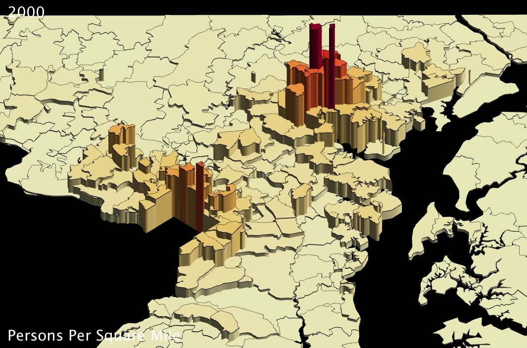
maryland counties population density 2 maryland counties population density 3
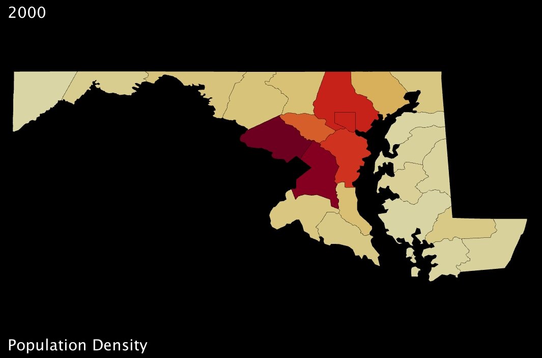
Maryland counties population density (US Census Bureau) - click to enlarge Maryland counties population density (US Census Bureau) - click to enlarge

My first “fix” with UUorld, therefore, was to choose a better color scheme — one which uses a gradual scale, where colors are adjusted by value (above-left). Then, I added labels directly to the counties so that questions akin to those posed in Ratwani’s tests — e.g. “What is the population of X county” — could be answered instantly (above-right).

What continues to amaze me is just how remarkable such small changes can be. Immediately, using the newer Maryland maps, one can detect all kinds of subtleties amongst those counties which were nothing but red in the first image. And, for instance, whereas in the original map Howard county is grouped with Anne Arundel and Baltimore counties, all of them appearing solid yellow, our newer maps show clearly that Howard is significantly less dense than its eastern neighbors (about 200 people per square mile less so).2

maryland counties population density 2 maryland counties population density 3
Maryland counties population density (US Census Bureau) - click to enlarge Maryland counties population density (US Census Bureau) - click to enlarge

… And of course all exposed patterns are even clearer in 3D.

What interests me so much about the study Mr. Ratwani put together is that his point of departure was to measure how much thinking was required to answer a question using different maps. That strikes a chord with me because our company was created in recognition of the shortcomings of many charts and graphs, and the incredible informative potential of thematic mapping. It is exciting to envision a scientific analysis of how exactly 3-dimensional mapping improves cognitive efficiency.

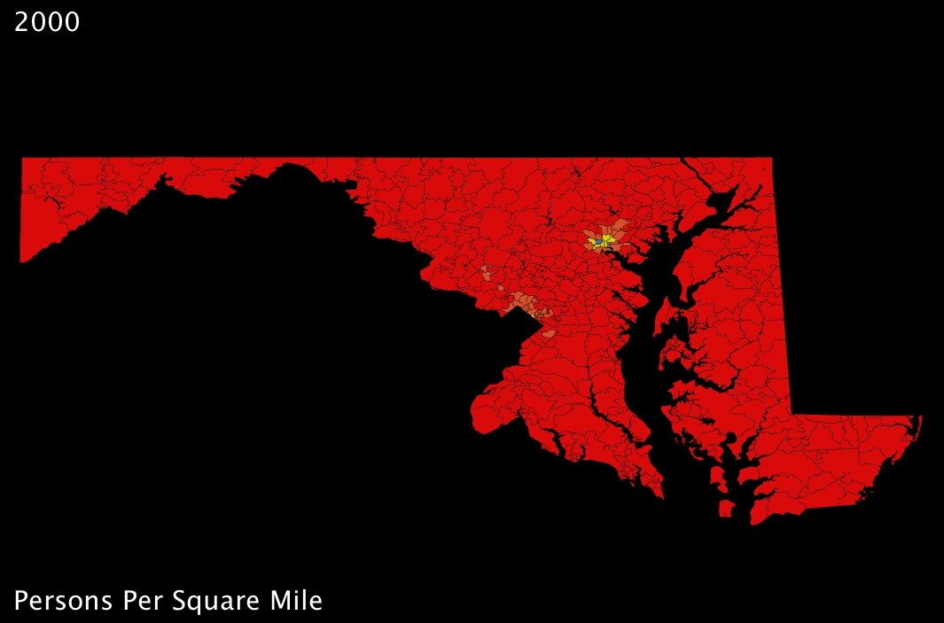
For my part, I find that handling statistics with UUorld pushes me towards new discovery. In the case of Maryland population density, I was intrigued that the county-level maps seemed to indicate Washington DC suburbs were even more densely populated than the county that actually contains Baltimore. To put my musings to rest, I loaded up the zip-code level data from our Data Portal and very quickly had the answer: Baltimore is the most densely populated part of Maryland; the county-level maps just aren’t fine-grained enough to pick up the nuance.

Now I’m curious to go back and check on other major metropolitan areas around the country…

maryland zip codes population density 1 maryland zip codes population density 2
Maryland zip codes population density (US Census Bureau) - click to enlarge Maryland zip codes population density (US Census Bureau) - click to enlarge
maryland zip codes population density 3 maryland zip codes population density 4
Maryland zip codes population density (US Census Bureau) - click to enlarge Maryland zip codes population density (US Census Bureau) - click to enlarge


Footnotes:

1. Mr. Ratwani’s research, published in the Journal of Experimental Psychology, can be found here.
2. US Census Bureau 2000 population density figures: Howard County 983, Baltimore County 1259, Anne Arundel County 1177. (persons per square mile)

Heatmaps for Twitter

January 26th, 2009 by Chris Mueller

Today we are announcing the release of a new version of The Word on the Tweet, our Twitter/map mashup. With this version, we are generating heatmaps (or density maps) of words as they are tweeted around the globe.

For example, here are maps for the words “love” and “hate”:

Tweets containing the word "love"

Tweets containing the word "hate"

Note that the maps generated using this service are based on a sampling of the Twitter public timeline, which itself is a sample of all Twitter traffic. The data is not up-to-the second in accuracy, but will reflect the general trend over the past several weeks. Some words or brands that are more uncommon may not be available yet.

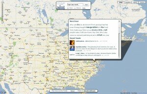
Double-clicking on a location brings up a word cloud and a selection of the most recent tweets from that location:

Word Cloud and Recent Tweets

Word Cloud and Recent Tweets for Washington, DC

There are many fascinating patterns to be discovered. Pan the map, zoom, search in multiple languages. Enjoy!

Launch the Word on the Tweet

PS: the original version of the Word on the Tweet is still available.

The Word on the Tweet

December 9th, 2008 by Chris Mueller

We recently built a tool to help us understand what people were saying at a specific location. It’s a first draft (beta) version. Take a look:

Launch The Word on the Tweet

We combined a Google Map with the Twitter API to discover words that were common to a place. When you click on the map, we pull the top 40-50 words from Twitter within a 25-50 mile radius. The service works best in English.

Some interesting trends from the past couple of days:

  • San Diego: Jet, F18, crash
  • Kansas City: Snow
  • San Francisco: Confessions
  • Washington DC: Obama, Blagojevich
  • Dublin: Beef, pork
  • Liverpool: Xbox, dashboard
  • Baghdad: Vacation

What can you discover? Feel free to send us your comments about The Word on the Tweet.

Proxy Servers

December 8th, 2008 by Chris Mueller

UUorld’s networking capabilities are limited inside some networks that use proxy servers. If your network uses a proxy, you will likely see a blank page when you click “Browse Stats”.

We will be releasing a new version soon with the proxy issues resolved. If you would like to be emailed when we update this issue, please contact us.

Database Issue

November 26th, 2008 by Chris Mueller

We recently learned that there is an error when launching UUorld on some versions of Windows XP. The error is “Database Connection Error. Exiting.”

If you are receiving this error, we are working to get it fixed as quickly as possible. If you want, send us an email and we’ll keep you in the loop.

Where Obama Won — ‘08 Election County Analysis

November 13th, 2008 by Zach Wilson

Note: We gathered this data from major media outlets as they posted it, and it is not necessarily reflective of the most current tabulation. For the most recent and official data we suggest Dave Leip’s Election Atlas. Any of his data can easily be imported into our software.

http://www.uselectionatlas.com

Also, please note that what follows is a somewhat detailed handling of patterns in election data. For a more general overview you may want to scroll down to the next couple of posts. If you are going to skip down the page, you may want to quickly look at the last four images of this post anyway because Obama’s victory in Indiana, shown there, is a real standout among the many images that follow.

A prominent aspect of US election geography is that most urban areas favor Democrats and most rural areas favor Republicans. This past November 4th, while more overall counties voted Republican, Obama won because most of the most populated counties voted for him. We can see this pattern in the two images below. Flat counties in dark red are McCain victories, while all counties rising from the map are Obama victories, and the tallest and most blue are the places where Obama won the greatest percentage of the vote. With the purely color-coded map it is obvious how many more counties preferred McCain — all of the dark red ones. In the second image, it is much easier to see which areas favored Obama, and to what extent.

Arguably, a more interesting detail of the recent election is how, or rather where, Obama won that Kerry didn’t. We can begin to see where Obama gained votes by looking at voting trends from 2004 to 2008 in contrast with voting trends from 2000 to 2004. The images below use color to show the rate of change in the percentage of the vote going to the Democrat candidate. During each time period, blue counties have an increasing percentage of the vote leaning to Democrats, and in red counties the Democrat percentage is decreasing (which is to say red indicates an increase in Republican preference).

The image below shows that from 2000 to 2004 much of the Plains states, the South, and Utah, and Texas tended more Republican. In this case, blue counties are those that voted in a greater percentage for Kerry than they did for Gore.

Most of the next image down is blue, showing that most counties favored Obama against McCain to a greater extent than they had favored Kerry against Bush. The red counties preferred McCain more than they preferred Bush relative to their respective rivals. A band of counties stands out running from the Appalachians into Arkansas, also part of the panhandle of Florida, and western Louisiana. In addition we can see McCain’s home-state advantage — Arizona leaned slightly Republican this election in contrast with neighboring states.

We can extend the analysis further by looking more closely at a few regions and by adding another variable to the analysis. In the following images, colors will follow the same pattern as in the last two images, with red indicating an increase in the percentage vote for Republicans and blue as an increase in the percentage vote for Democrats. In addition height will show whether or not a county voted more than %50 for the running Democrat. All flat counties were Republican victories and all counties above the map were Democrat victories.

Specifically, in both of the next two images, color indicates the direction of change from 2004 to 2008, but in the first image, the counties above the map are counties Kerry won, and in the second image the counties above the map are counties Obama won. These settings mean that anywhere above the map in the first image and flat on the second image is a county that Obama lost. Obama’s relative losses are always red. By contrast, anywhere in blue, and above the map in the second image, but flat in the first image, is a county Obama added to the Democrat coalition.

Maybe you can see that Obama lost counties in parts of Florida and West Virginia and Kentucky and gained in North Carolina, Indiana, and other parts of Florida.  Don’t strain your eyes too much though, as we’ll take a closer look right away; first the nationwide images…

Looking more closely at the West we can see that Obama did broadly better than Kerry (shown by blue) whether or not the county was in aggregate a Democrat victory, and as noted earlier, McCain did slightly better than Bush in Arizona.

Moving east and focusing on the areas of Texas and West Louisiana where the Democrat share of the vote declined (in red), we can see that very few of these counties were won by Kerry because these areas are flat. By contrast some counties in Arkansas were won by Kerry (shown as elevation) but appear in red, which suggests Obama may have lost some of these counties that Kerry had won.

Looking from the west at Arkansas and into the Appalachians, we can see through a comparison of the next two images that some red counties switched from a majority favoring Kerry to a majority favoring McCain. In the first image we have counties above the map if Kerry won these counties. In the second image the counties above the map are counties Obama won. As a result, we know that Obama lost some counties that Kerry had won in this red band, but at the same time much of this band was Republican leaning to begin with and only became more so.

Looking from the south, we can see that Obama also lost a few counties that Kerry had won in Florida. In the second image, Jefferson Davis County stands out as an example of where Obama retained a majority of the vote despite winning a lesser share than Kerry. We can also see in this region that Obama increased the percentage vote won in places that already voted heavily Democrat.

We’ll now turn to examine a few states where Obama won new counties and earned these state’s electoral votes as a result. For example, this was the case in Florida. Obama lost counties in the panhandle but made up ground by winning other counties Kerry had not, a few of them being panhandle counties neighboring those he lost. The colors in the first image show the trend in voting from 2000 to 2004. In the second and third images, color indicates the trend direction from 2004 to 2008, and height shows, where Kerry won, and then where Obama won. Given the high population in Miami-Dade County (in the far south east and poping off the map in the final image), we can be sure it was important for Obama’s victory in the state, though the general blue trend of most counties is also notable.

A quick look at trends in Ohio shows us that Kerry and Obama gained ground in rather different counties, split along an east-west divide. The first image is the trend for 2000 to 2004. The second image is the trend from 2004 to 2008.

In North Carolina, we can see the trends 2000 to 2004 and then 2004 to 2008, just as above, except in North Carolina Obama’s gains were more consistent, improving the Democrat margin in most counties, matched by Kerry’s fairly consistent losses shown in the first image.

These widespread gains tipped the balance to gain the state for Obama. Below, colors remain as in the most recent image, showing where Obama gained ground, and height shows first where Kerry earned a majority, then where Obama was able to nudge above %50 of the vote. You may have to look closely to count them because mainly the differences are small, but every county that nudges off the map in the second image is a place that helped secure North Carolina for Obama.

Last, but possibly most striking, we’ll look at Indiana. These four images follow the same pattern as the last four. First, the trend 2000 to 2004. Second, the trend 2004 to 2008. Third we use height to show those counties won by Kerry. Fourth we use height to show those counties won by Obama.