UUorld on Twitter
February 11th, 2009 by Willy Pell
You can now follow on Twitter here:
We will be posting development progress and participating in a general conversation about the direction of the product. Jump in!
February 11th, 2009 by Willy Pell
You can now follow on Twitter here:
We will be posting development progress and participating in a general conversation about the direction of the product. Jump in!
February 10th, 2009 by George Maasry
The “American Recovery and Reinvestment Plan1,” as christened by President Obama, is meant to channel funds into areas critical to both the short- and long-term health of the US economy. Amidst online discussions of the plan, I came across a series of interesting articles on National Public Radio’s blog, in a section dedicated to economics called “Planet Money.”
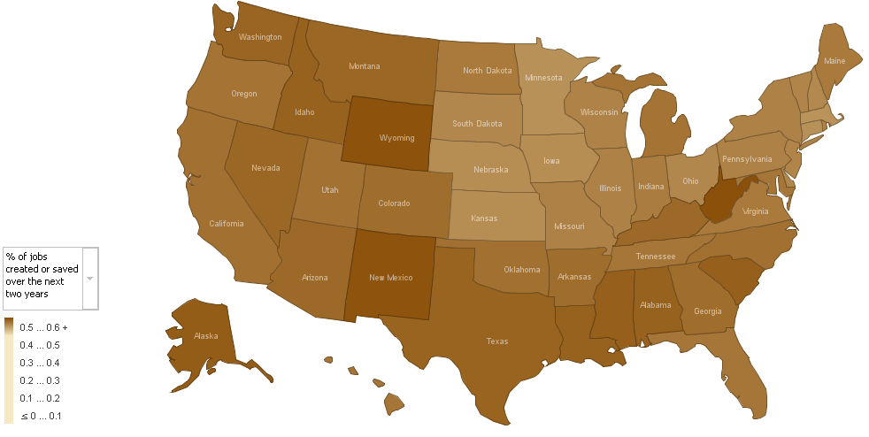 |
These articles, authored by Alan Cordova2, analyze five elements of the stimulus package, based on estimates released by the White House3 last week. Mr. Cordova did a bit of data crunching with other US-government datasets, which I’ve emulated (household counts and employment figures from the Census Bureau)4, and produced some flat maps to |
| Alan Cordova’s map on Job Creation - click to enlarge |
show which states would be most affected by each part of the stimulus package. He used IBM’s online visualization generator5, “Many Eyes,” to create the maps; incidentally, Many Eyes is part of what IBM calls its “Collaborative User Experience” project, and is a nifty interface to create some simple, incisive visualizations. But I digress.
Mr. Cordova’s post piqued my curiosity, and gave me a hankering to actually interact with the numbers myself; so, I reproduced his data and imported it into UUorld. To get spending numbers for individual states, I drew from the memo released by White House economic advisor Brian Deese last week. You can find that memo here.
The memo breaks benefits into five areas, in accordance with new programs; I thought I’d use the same. At first I played around with the sensitivity and ground-level values in UUorld for a bit so that each variable would display with a complete range of colors (I found it hard to differentiate between states in some of the brown 2D maps). In so doing, I came across an array of patterns I wasn’t aware of at first take:
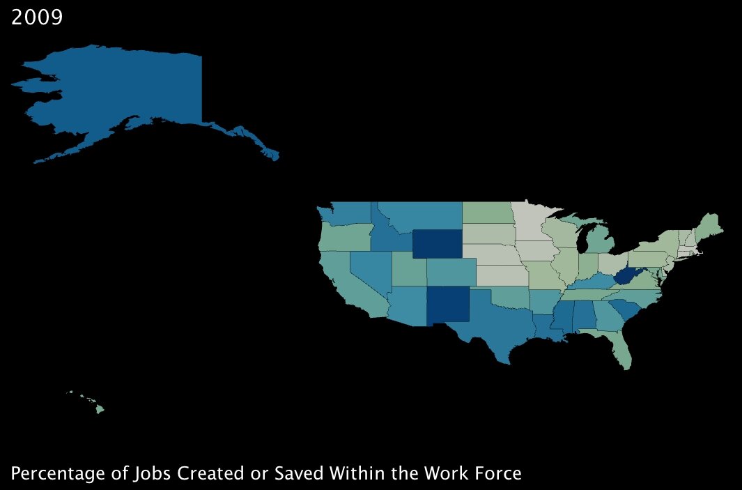
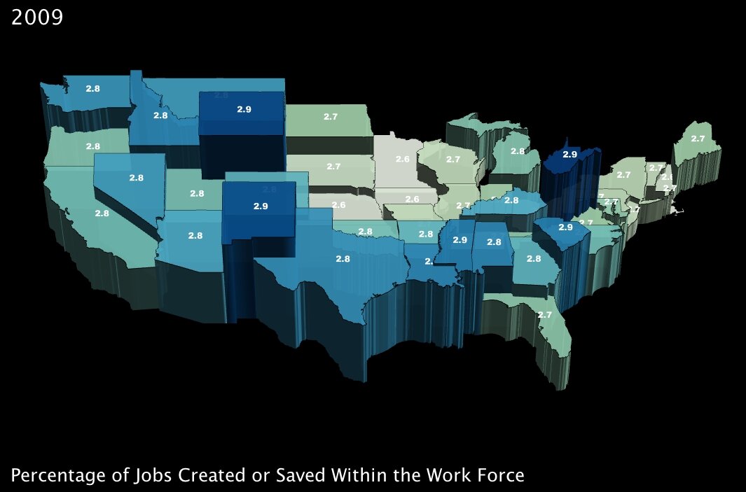
1. The number of jobs projected to be created or saved over the next two years, as a percentage of total employment in a state. (click images to enlarge)
 |
 |
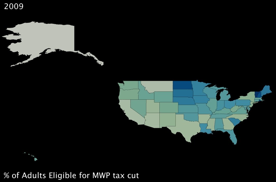
2. The percentage of working-age adults eligible to receive a “Making Work Pay” tax cut of up to $1000. (click images to enlarge)
 |
 |
These first two variables measure benefits that will, in theory, directly combat poverty. The first is of course job creation; the second translates to fiscal support for working adults who are below the poverty line — it’s a basic extension of the Earned Income Tax Credit6 (established under Ford, one of the rare domestic fiscal-policy creations that has garnered support from both political parties).
Interestingly, the two benefits seem to complement each other almost perfectly; in states where fewer jobs will be created by percentage, almost without exception, more families are supported by the tax credit. Also interestingly, a few southern states in particular — Lousiana, Alabama and South Carolina (and to an extent Kentucky) — will reap significant benefits from both parts of the program. These states are among the poorest in the Union (all in the bottom 10 by income)7, so at first glance, the added support seems well placed.
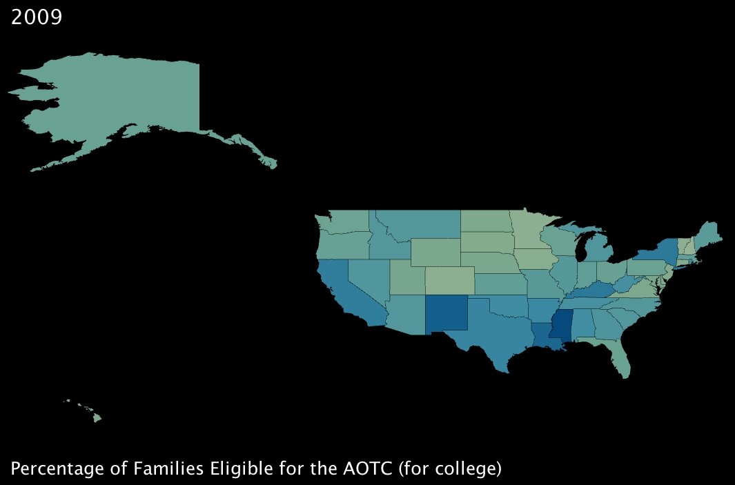
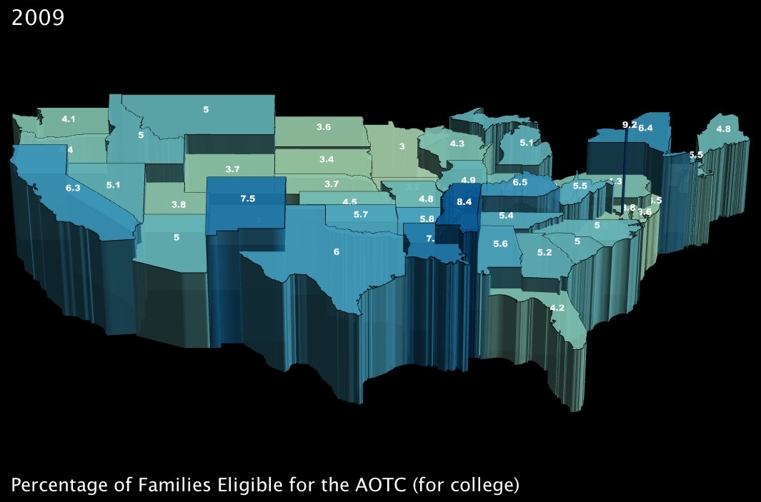
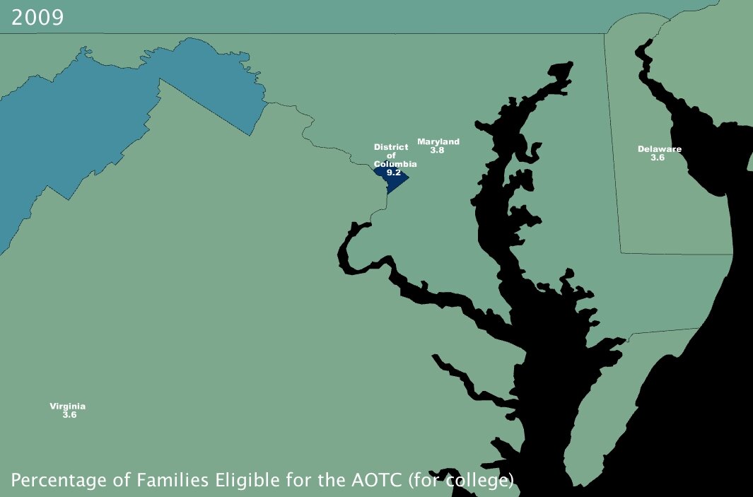
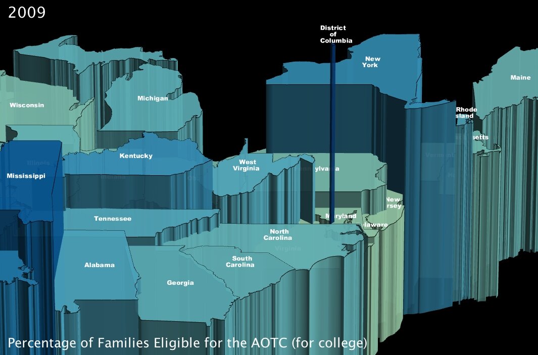
3. The percentage of families that will become eligible for government aid called the American Opportunity Tax Credit, which is geared specifically towards making college affordable for poorer families. (click images to enlarge)
 |
 |
 |
 |
The AOTC is meant to eliminate around two-thirds of college costs for families in need by furnishing a $4000 tax credit in exchange for 100 hours of community service performed by the candidate8.
It immediately jumped out at me that Washington DC, at 9.2% of families eligible, has about twice the number of possible candidates by percentage than most of the rest of the states in the Union. Conventional “wisdom” would hazard me to guess that this is because even though the District is not the poorest state — actually by per capita income it ranks as high as 16th7 — its population is severely divided economically. Note to self: look into statistics on that for a future post.
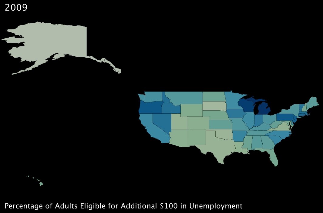
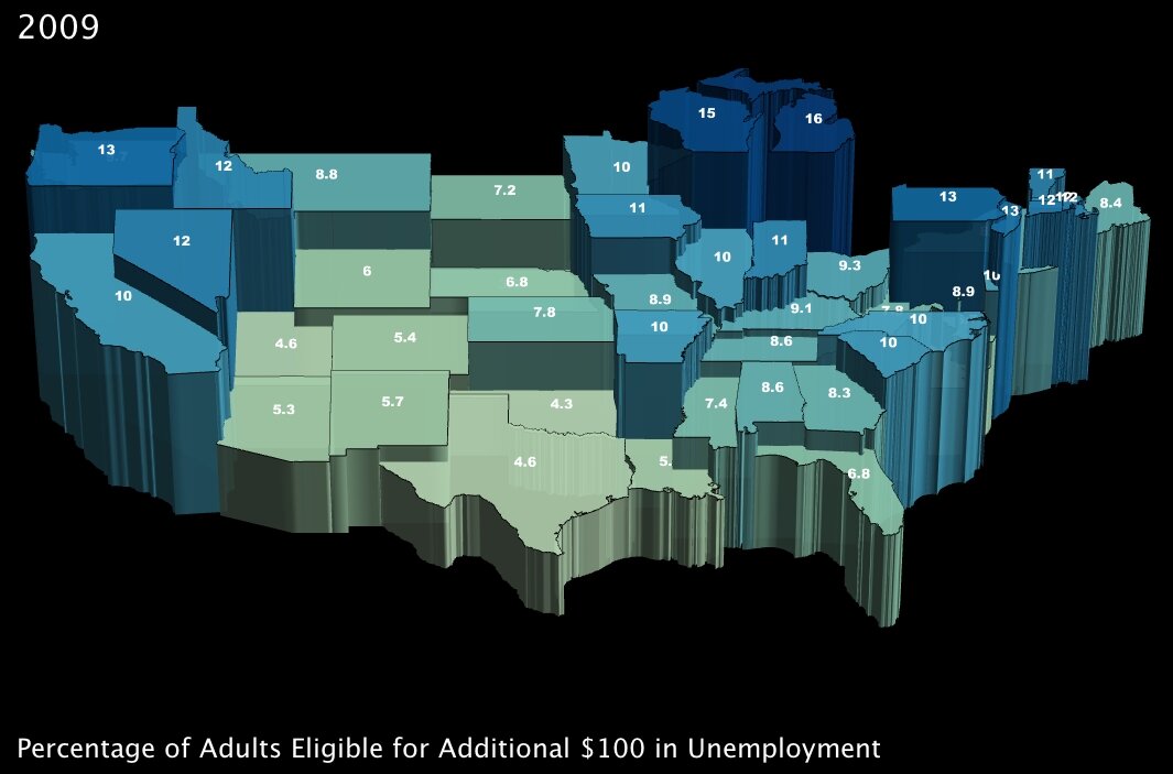
4. The percentage of working-age adults eligible to receive an additional $100 per month in unemployment insurance benefits. (click images to enlarge)
 |
 |
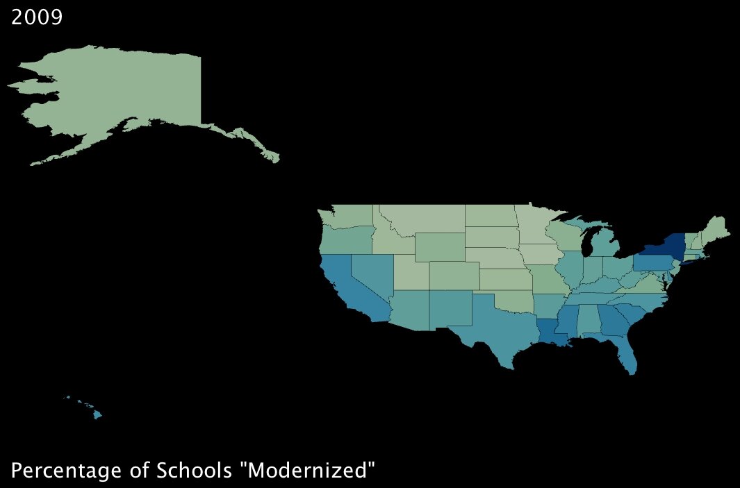
5. The percentage of schools that will undergo so-called “modernization.” (click images to enlarge)
 |
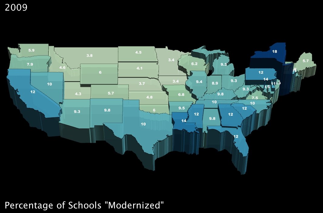 |
Between these two measures, again it looks like benefits are well distributed around the country. While the additional unemployment credit will have greater effect in the northern states, it seems that southern states will benefit more from the school “modernization” project9 encapsulated within the stimulus plan.
–
When I started working with this data, my intention was to determine whether certain states were favored by the stimulus package (by measure of these variables, anyway). As it turned out, interestingly, the benefits seem to be more or less evenly distributed across the country … and while that may be a positive sign for the plan itself, it doesn’t do much to answer my question.
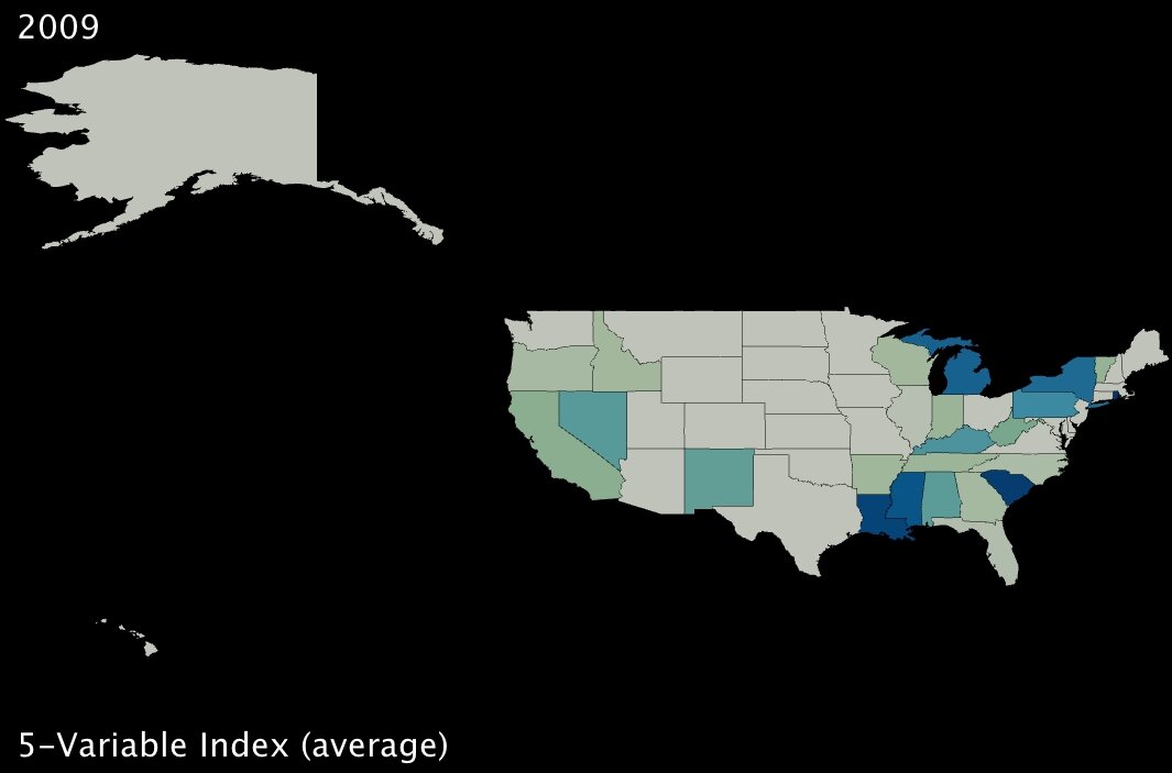
To dig a bit deeper, I took standard deviations and calculated z-scores10 for all five variables; then I created a new index variable by taking the average z-score for each state. Here are the results:
 |
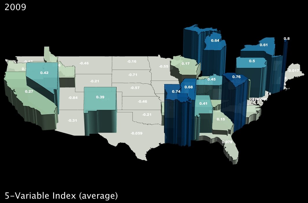 |
The states in darker blue (and elevated in the second image) are the ones most positively affected, in the aggregate, by the five benefits of the stimulus package as originally delineated by the Deese memo.
It bears noting that Alaska ranks dead last, receiving the fewest benefits on average as measured by our given variables. However, it would be hard to argue that Obama is using the stimulus package to play favorites, at least on a state-wide level, given that his home state of Hawaii is quite far down the list as well (about two-thirds of the states fare better than Hawaii using this index).
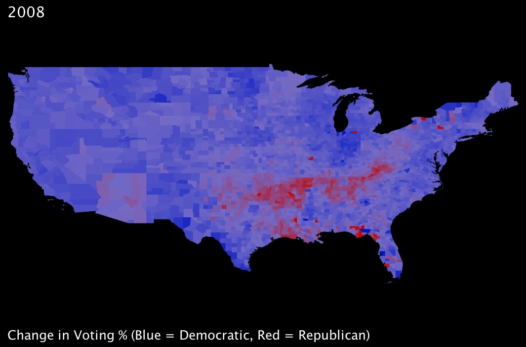 |
Back during the immediate aftermath of the election, I looked at a range of statistics comparing voting trends — and my colleagues and I wrote some blog posts about those trends. Most notable, to my mind, is that almost without exception the country voted more democratically — that is, more in favor of Obama — than it had four years prior; this held true for even most states that are typically staunchly Republican. While the state may still have gone to John McCain in 2008, the overall |
percentage of Democratic votes often dramatically increased from the Bush-Kerry election of 2004. The one exception to this was a strong tendency towards more Republican voting within a band spanning one of the poorest parts of the country: namely, the mouth of the Mississippi River in Mississippi and Louisiana, stretching up through Arkansas, and across Tennessee into Kentucky and West Virginia.
As I was familiar with this trend, I was surprised to note that the stimulus-plan index I created seems to show those same states are for the most part going to benefit proportionally more than many of their peers. Somewhat ironic, perhaps … or could the stimulus plan intentionally favor those constituents with whom Obama is currently least popular? To assert the numerical validity of that assumption, I pitted state-level election results (percentage of the vote won by the Democrats) against the 5-variable index by testing for statistical correlation11. The result was a correlation coefficient of 0.166, meaning that if anything there is a slight tendency for those states that voted for Obama to benefit more from the plan.
While 0.166 is not a strong correlation indicator either way, it does represent the strength of all five variables, averaged. As I had already found out, the benefits of each part of the plan are spread across the country in different proportions. Thus, I also tested for correlation between voting results and the 5 variables individually:
| ALL. Five-Variable Index and % of 2008 Obama Votes: Correlation Coefficient = 0.1658 [small positive correlation] |
| 1. Job Creation and % of 2008 Obama Votes: Correlation Coefficient = -0.6336 [large negative correlation] |
| 2. Adults with MWP and % of 2008 Obama Votes: Correlation Coefficient = 0.1162 [small positive correlation] |
| 3. Families with AOTC and % of 2008 Obama Votes: Correlation Coefficient = 0.1240 [small positive correlation] |
| 4. $100 Benefits and % of 2008 Obama Votes: Correlation Coefficient = 0.3741 [positive correlation] |
| 5. Schools Modernization and % of 2008 Obama Votes: Correlation Coefficient = 0.3721 [positive correlation] |
This seems to indicate that the job creation forecasted by the White House tends strongly to states that voted against Obama. What the exact measures are to be taken to create those jobs is somewhat unclear, but that Republican-voting states are the predicted beneficiaries is striking.
Of course, correlation is not at all the same thing as causation. I remain wary that the demographic and economic differences that render certain parts of the country susceptible to one element of the stimulus package may be unrelated to whatever factors underpin ideological tendencies in a given direction.
As always, UUorld has helped me explore my questions, answer them, and then find many more.
—
Footnotes:
1. Wikipedia America Recovery and Reinvestment Plan.
2. Alan Cordova is a writer for “Planet Money” at National Public Radio. .
3. Boston Herald. “White House estimates new jobs in stimulus plan” by the Associated Press.
4. American Community Survey. The US Census Bureau’s 2006 tally of households by state; and American Community Survey. The US Census Bureau’s 2006 count of total employed adults by state.
5. research group. Many Eyes online data visualization tool.
6. Internal Revenue Service. Earned Income Tax Credit definition, questions and answers.
7. Wikipedia States of the US by Income.
8. . American Opportunity Tax Credit - Definition and Overview.
9. National Clearinghouse for Educational Facilities. Federal funding stimulus for school facilities: description and comparison of bills.
10. Wikipedia Standard score. Standard deviations were calculated like this: The differences between each value and the mean value are squared, summed, and then divided by the total number of measurements.
11. .
February 4th, 2009 by George Maasry
I recently read a post on Cognitive Daily entitled “Reading graphs — How we do it, and what it tells us about making better ones.” The post exposed the research performed by cognitive scientist Raj Ratwani1, with the goal of tracking eye movements of respondents analyzing a basic population density map.
The inferences were fascinating, and reinforce many of the concepts that have inspired our work here at UUorld. In a nutshell, when posed questions that required analysis (rather than simple observation), respondents were stymied by disparate elements of the presentation: a four-level color scheme and cryptic legend essentially forced them to absorb the data in several steps, processing each step one after the other. The study found that respondents first had to “integrate the graph visually — that is, determine which cluster goes with which data. Then, [they had to] cognitively integrate — figure out the relationship between the clusters.”
 |
|
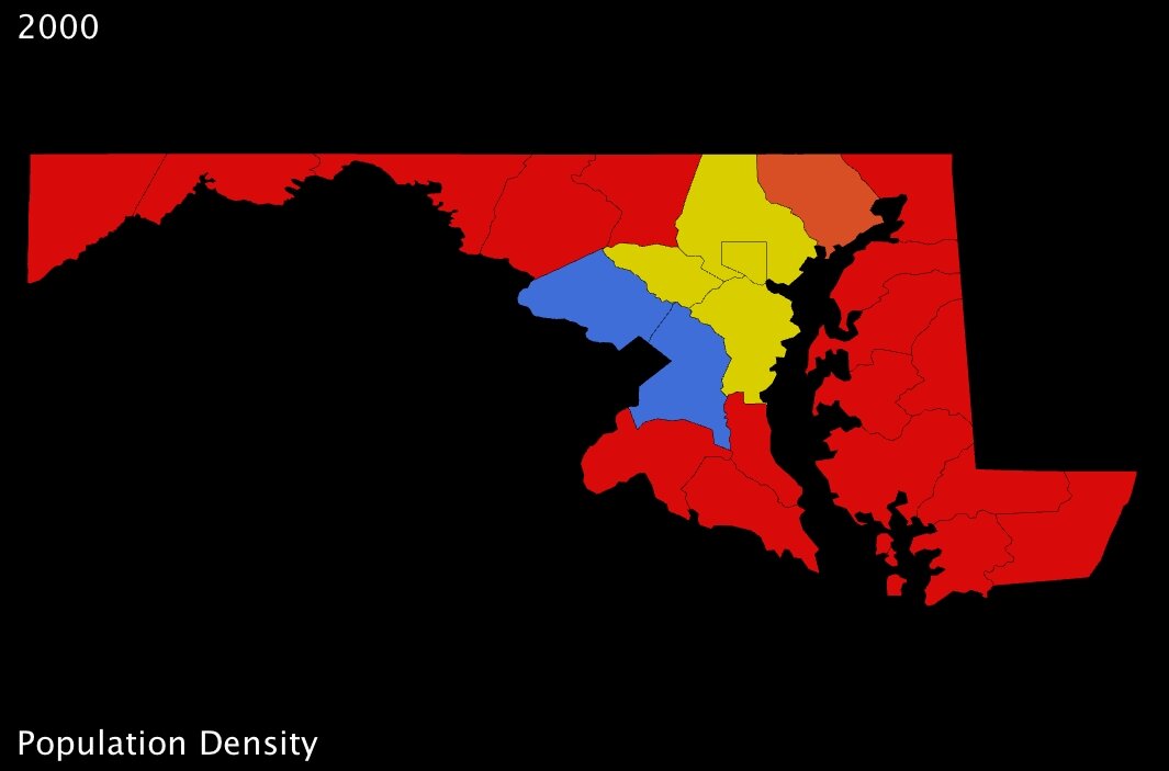
| Maryland counties population density in 2000 (US Census Bureau) - click to enlarge |
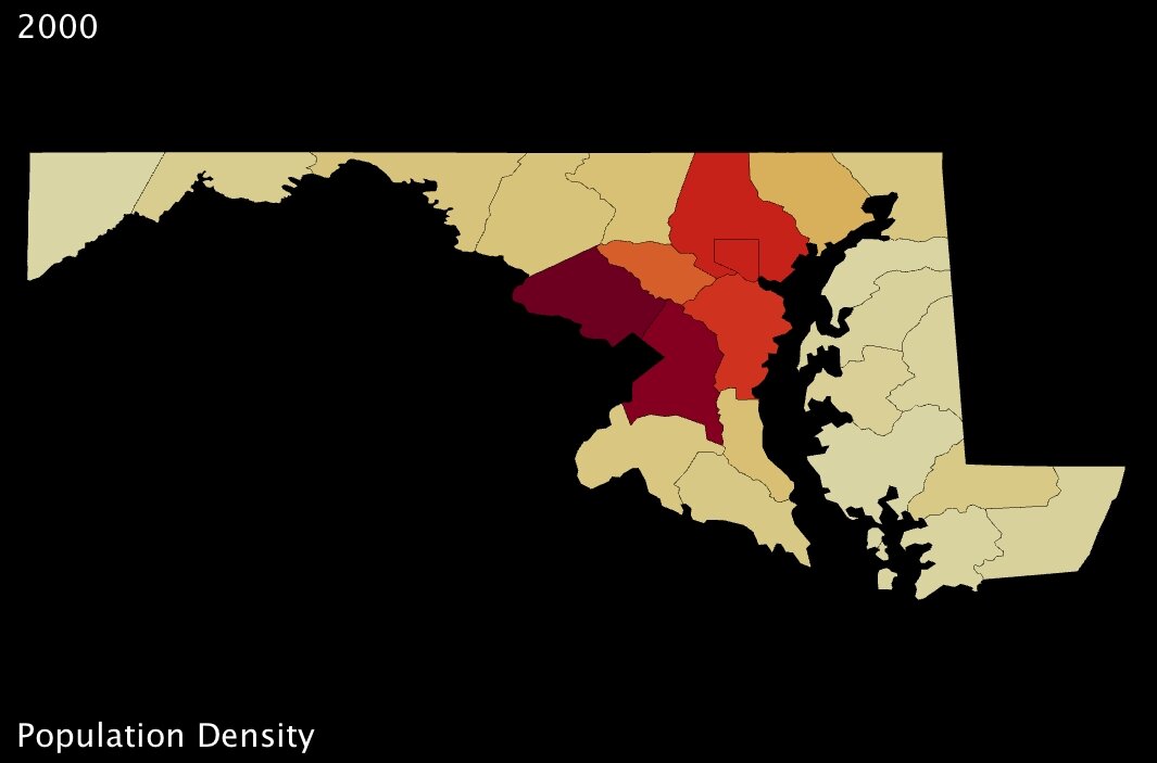
Ratwani and his crew used maps very similar to the one I’ve put together here (above). While they used a fictional state, they distributed the counties across it such that obvious “bands” of higher and lower population density were immediately apparent. In my map here, I’ve chosen Maryland because its counties are distributed in a similar fashion. Immediately, we can see that a 4-color spectrum is useless when it comes to differentiating most of the counties in the state.
Of course, making information clearer through maps is basically UUorld’s mission statement, and so I jumped on the opportunity to use our visualization engine to improve upon the Maryland map, and counter the array of “tough spots” exposed by Ratwani’s research.
For starters, much of the difficulty respondents had with the simple density maps came from shifting focus between legend and map, because the map itself failed to convey information on its own about a given county’s measurement. It might be tempting to conclude from this that simply a better legend was needed; but on the contrary, to my mind, the major shortcoming is that the globs of color convey almost no information beyond identifying the most basic regional trends.
 |
 |
| Maryland counties population density (US Census Bureau) - click to enlarge | Maryland counties population density (US Census Bureau) - click to enlarge |
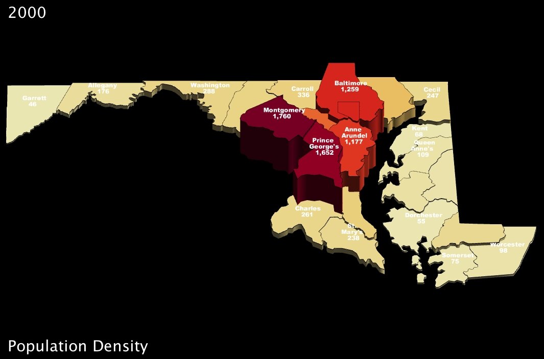
My first “fix” with UUorld, therefore, was to choose a better color scheme — one which uses a gradual scale, where colors are adjusted by value (above-left). Then, I added labels directly to the counties so that questions akin to those posed in Ratwani’s tests — e.g. “What is the population of X county” — could be answered instantly (above-right).
What continues to amaze me is just how remarkable such small changes can be. Immediately, using the newer Maryland maps, one can detect all kinds of subtleties amongst those counties which were nothing but red in the first image. And, for instance, whereas in the original map Howard county is grouped with Anne Arundel and Baltimore counties, all of them appearing solid yellow, our newer maps show clearly that Howard is significantly less dense than its eastern neighbors (about 200 people per square mile less so).2
 |
 |
| Maryland counties population density (US Census Bureau) - click to enlarge | Maryland counties population density (US Census Bureau) - click to enlarge |
… And of course all exposed patterns are even clearer in 3D.
What interests me so much about the study Mr. Ratwani put together is that his point of departure was to measure how much thinking was required to answer a question using different maps. That strikes a chord with me because our company was created in recognition of the shortcomings of many charts and graphs, and the incredible informative potential of thematic mapping. It is exciting to envision a scientific analysis of how exactly 3-dimensional mapping improves cognitive efficiency.
For my part, I find that handling statistics with UUorld pushes me towards new discovery. In the case of Maryland population density, I was intrigued that the county-level maps seemed to indicate Washington DC suburbs were even more densely populated than the county that actually contains Baltimore. To put my musings to rest, I loaded up the zip-code level data from our Data Portal and very quickly had the answer: Baltimore is the most densely populated part of Maryland; the county-level maps just aren’t fine-grained enough to pick up the nuance.
Now I’m curious to go back and check on other major metropolitan areas around the country…
—
Footnotes:
1. Mr. Ratwani’s research, published in the Journal of Experimental Psychology, can be found here.
2. US Census Bureau 2000 population density figures: Howard County 983, Baltimore County 1259, Anne Arundel County 1177. (persons per square mile)
With UUorld, you can quickly create and share maps to explore data over space and time.
» Download now
» Watch a screencast
You are currently browsing the UUorld Blog blog archives for February, 2009.