Company Blog

Archive for the ‘Interest’ Category

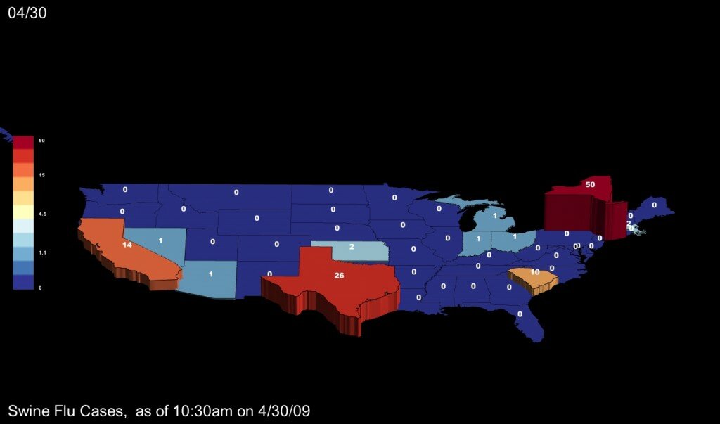
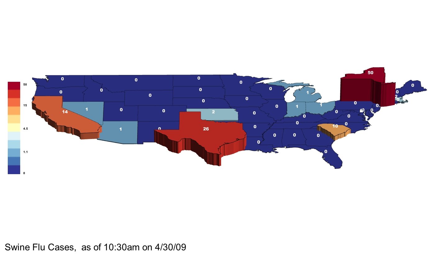
Map of Swine Flu Cases — CDC Reported, 10:30am on 4/30/09

April 30th, 2009 by Zach Wilson

Hi.  We’ll update this post as new numbers become available.

Our data is from the CDC : http://www.cdc.gov/swineflu/

Please let us know if you see new numbers before we do.  Thanks!

note: colors by log scale

Map backgrounds are provided in both black and white in case you want to post them anywhere else. If you want to adjust colors, scale, view angle or other details, please use our software, which can be downloaded in a free version from our main page.

Please note, colors are by logarithmic scale.

Please note, colors are by logarithmic scale.

Reading Maps, According to Cognitive Science

February 4th, 2009 by George Maasry

I recently read a post on Cognitive Daily entitled “Reading graphs — How we do it, and what it tells us about making better ones.” The post exposed the research performed by cognitive scientist Raj Ratwani1, with the goal of tracking eye movements of respondents analyzing a basic population density map.

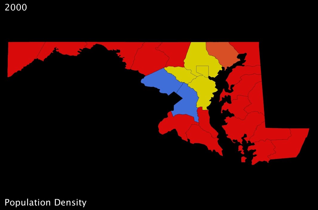
The inferences were fascinating, and reinforce many of the concepts that have inspired our work here at UUorld. In a nutshell, when posed questions that required analysis (rather than simple observation), respondents were stymied by disparate elements of the presentation: a four-level color scheme and cryptic legend essentially forced them to absorb the data in several steps, processing each step one after the other. The study found that respondents first had to “integrate the graph visually — that is, determine which cluster goes with which data. Then, [they had to] cognitively integrate — figure out the relationship between the clusters.”
maryland counties population density 1
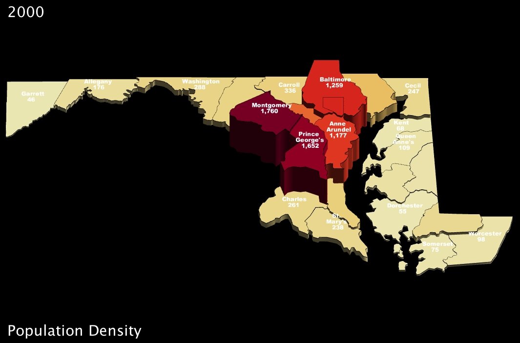
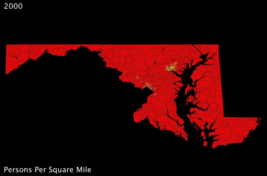
Maryland counties population density in 2000 (US Census Bureau) - click to enlarge

Ratwani and his crew used maps very similar to the one I’ve put together here (above). While they used a fictional state, they distributed the counties across it such that obvious “bands” of higher and lower population density were immediately apparent. In my map here, I’ve chosen Maryland because its counties are distributed in a similar fashion. Immediately, we can see that a 4-color spectrum is useless when it comes to differentiating most of the counties in the state.

Of course, making information clearer through maps is basically UUorld’s mission statement, and so I jumped on the opportunity to use our visualization engine to improve upon the Maryland map, and counter the array of “tough spots” exposed by Ratwani’s research.

For starters, much of the difficulty respondents had with the simple density maps came from shifting focus between legend and map, because the map itself failed to convey information on its own about a given county’s measurement. It might be tempting to conclude from this that simply a better legend was needed; but on the contrary, to my mind, the major shortcoming is that the globs of color convey almost no information beyond identifying the most basic regional trends.
maryland counties population density 2 maryland counties population density 3
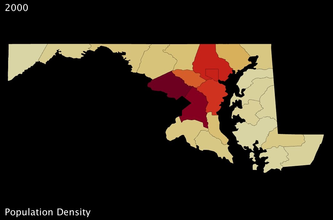
Maryland counties population density (US Census Bureau) - click to enlarge Maryland counties population density (US Census Bureau) - click to enlarge

My first “fix” with UUorld, therefore, was to choose a better color scheme — one which uses a gradual scale, where colors are adjusted by value (above-left). Then, I added labels directly to the counties so that questions akin to those posed in Ratwani’s tests — e.g. “What is the population of X county” — could be answered instantly (above-right).

What continues to amaze me is just how remarkable such small changes can be. Immediately, using the newer Maryland maps, one can detect all kinds of subtleties amongst those counties which were nothing but red in the first image. And, for instance, whereas in the original map Howard county is grouped with Anne Arundel and Baltimore counties, all of them appearing solid yellow, our newer maps show clearly that Howard is significantly less dense than its eastern neighbors (about 200 people per square mile less so).2

maryland counties population density 2 maryland counties population density 3
Maryland counties population density (US Census Bureau) - click to enlarge Maryland counties population density (US Census Bureau) - click to enlarge

… And of course all exposed patterns are even clearer in 3D.

What interests me so much about the study Mr. Ratwani put together is that his point of departure was to measure how much thinking was required to answer a question using different maps. That strikes a chord with me because our company was created in recognition of the shortcomings of many charts and graphs, and the incredible informative potential of thematic mapping. It is exciting to envision a scientific analysis of how exactly 3-dimensional mapping improves cognitive efficiency.

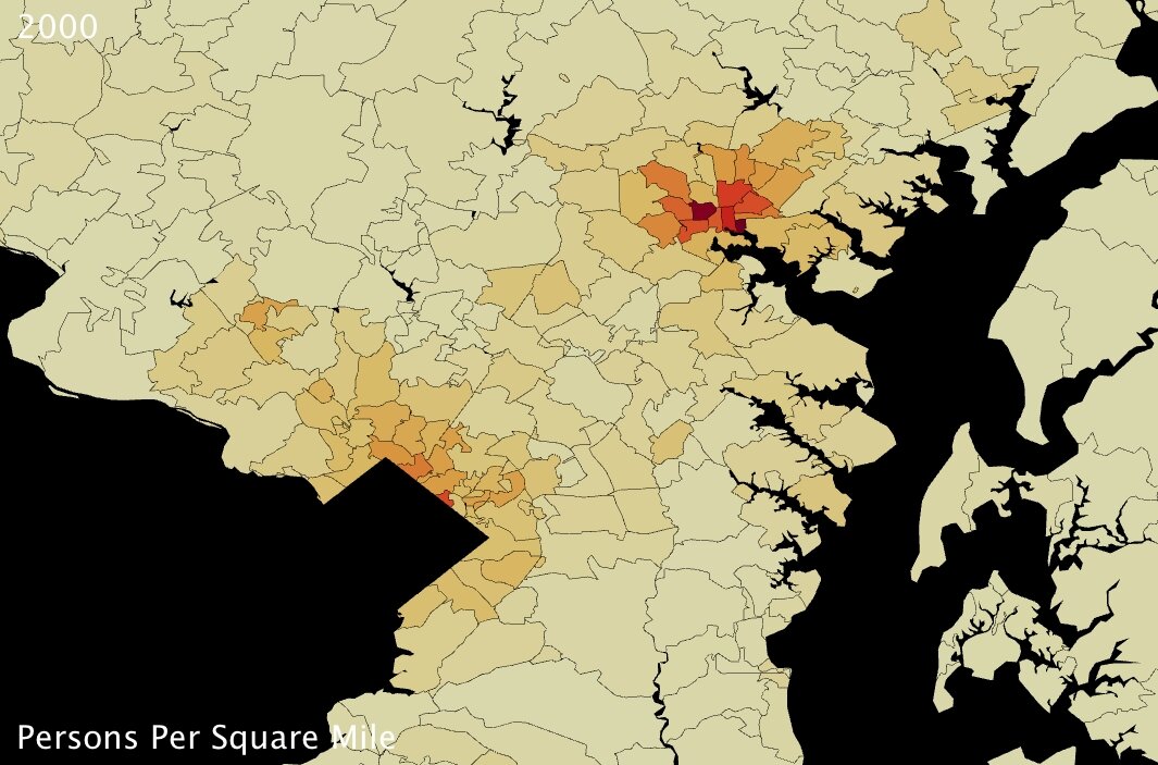
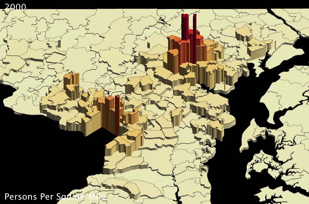
For my part, I find that handling statistics with UUorld pushes me towards new discovery. In the case of Maryland population density, I was intrigued that the county-level maps seemed to indicate Washington DC suburbs were even more densely populated than the county that actually contains Baltimore. To put my musings to rest, I loaded up the zip-code level data from our Data Portal and very quickly had the answer: Baltimore is the most densely populated part of Maryland; the county-level maps just aren’t fine-grained enough to pick up the nuance.

Now I’m curious to go back and check on other major metropolitan areas around the country…
maryland zip codes population density 1 maryland zip codes population density 2
Maryland zip codes population density (US Census Bureau) - click to enlarge Maryland zip codes population density (US Census Bureau) - click to enlarge
maryland zip codes population density 3 maryland zip codes population density 4
Maryland zip codes population density (US Census Bureau) - click to enlarge Maryland zip codes population density (US Census Bureau) - click to enlarge


Footnotes:

1. Mr. Ratwani’s research, published in the Journal of Experimental Psychology, can be found here.
2. US Census Bureau 2000 population density figures: Howard County 983, Baltimore County 1259, Anne Arundel County 1177. (persons per square mile)
Heatmaps for Twitter

January 26th, 2009 by Chris Mueller

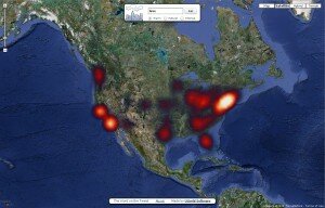
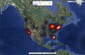
Today we are announcing the release of a new version of The Word on the Tweet, our Twitter/map mashup. With this version, we are generating heatmaps (or density maps) of words as they are tweeted around the globe.

For example, here are maps for the words “love” and “hate”:

Tweets containing the word "love"

Tweets containing the word "hate"

Note that the maps generated using this service are based on a sampling of the Twitter public timeline, which itself is a sample of all Twitter traffic. The data is not up-to-the second in accuracy, but will reflect the general trend over the past several weeks. Some words or brands that are more uncommon may not be available yet.

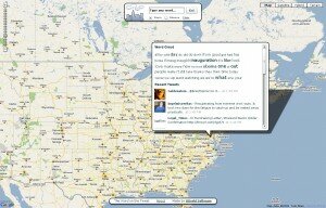
Double-clicking on a location brings up a word cloud and a selection of the most recent tweets from that location:

Word Cloud and Recent Tweets

Word Cloud and Recent Tweets for Washington, DC

There are many fascinating patterns to be discovered. Pan the map, zoom, search in multiple languages. Enjoy!

Launch the Word on the Tweet

PS: the original version of the Word on the Tweet is still available.

The Word on the Tweet

December 9th, 2008 by Chris Mueller

We recently built a tool to help us understand what people were saying at a specific location. It’s a first draft (beta) version. Take a look:

Launch The Word on the Tweet

We combined a Google Map with the Twitter API to discover words that were common to a place. When you click on the map, we pull the top 40-50 words from Twitter within a 25-50 mile radius. The service works best in English.

Some interesting trends from the past couple of days:

  • San Diego: Jet, F18, crash
  • Kansas City: Snow
  • San Francisco: Confessions
  • Washington DC: Obama, Blagojevich
  • Dublin: Beef, pork
  • Liverpool: Xbox, dashboard
  • Baghdad: Vacation

What can you discover? Feel free to send us your comments about The Word on the Tweet.

KML for the 2008 Presidental Elections

November 10th, 2008 by Chris Mueller

We have collected and processed election results by county for the 2008 US Presidential elections. KML files depicting the elections are available here:

  • Percent votes Democrat, by county. (KMZ)
  • Percent votes Republican, by county (KMZ)

These files can be downloaded directly into Google Earth or other geo-browsers.

2008 Election Democratic Counties in Google Earth

Democratic Counties

Republic Counties

Republican Counties

If you run Windows and have the Google Earth plugin installed in your browser, you can also view the or KML files in EarthAtlas.

Please note that we currently do not have results by county for Alaska. This data was collected as it was posted by major media outlets. Some county-level data in the Northeast is approximated from preliminary town-level reporting. Also, we are aware of about ten towns and cities across the country that are not properly represented in these KML files.

For full election coverage and data sets, we recommend Dave Leip’s US Election Atlas. He provides very high quality election data packages and any data purchased from the Atlas can be loaded into UUorld.

2008 Election Videos and Pictures

November 10th, 2008 by Willy Pell

We were very excited to get our hands on the new election data. The first thing we wanted to see was a video showing how voting patterns have changed from the 2000 Bush vs. Gore election through the 2004 Bush vs. Kerry election and to the 2008 Obama vs. McCain election. We were expecting a dramatic shift:

County Height = % Democratic Votes
Bluer Color = higher % Democratic Votes
Redder Color = higher % Republican Votes
Whiter Color = even

County Height = % Republican Votes
Bluer Color = higher % Democratic Votes
Redder Color = higher % Republican Votes
Whiter Color = even

There really has only been a slightly perceptible shift in voting patterns over the last 8 years and 3 elections. I had to speed up the clock dramatically just to make the change visible.

The next two images are colored by rate of change from one party to another.

Blue = Movement from Republican to Democrat
Red = Movement from Democrat to Republican
White = No change
Height = % Republican votes

Rate of change between the 2000 Bush vs. Gore Election and the 2004 Bush vs. Kerry Election:

Rate of Change between the 2004 Bush vs. Kerry Election and the 2008 Obama vs. McCain Election:

Now we see a more dramatic shift. Barring a swathe of Southern and Appalachian counties which became more Republican, most of the counties either stayed the same or became more Democratic.

Election Maps

May 20th, 2008 by Chris Mueller

We found these election maps on Daily Kos to be very interesting. They provide county-level aggregations of the Democratic primary elections results, using color blending to indicate how much a region favored Clinton, Obama, or Edwards.