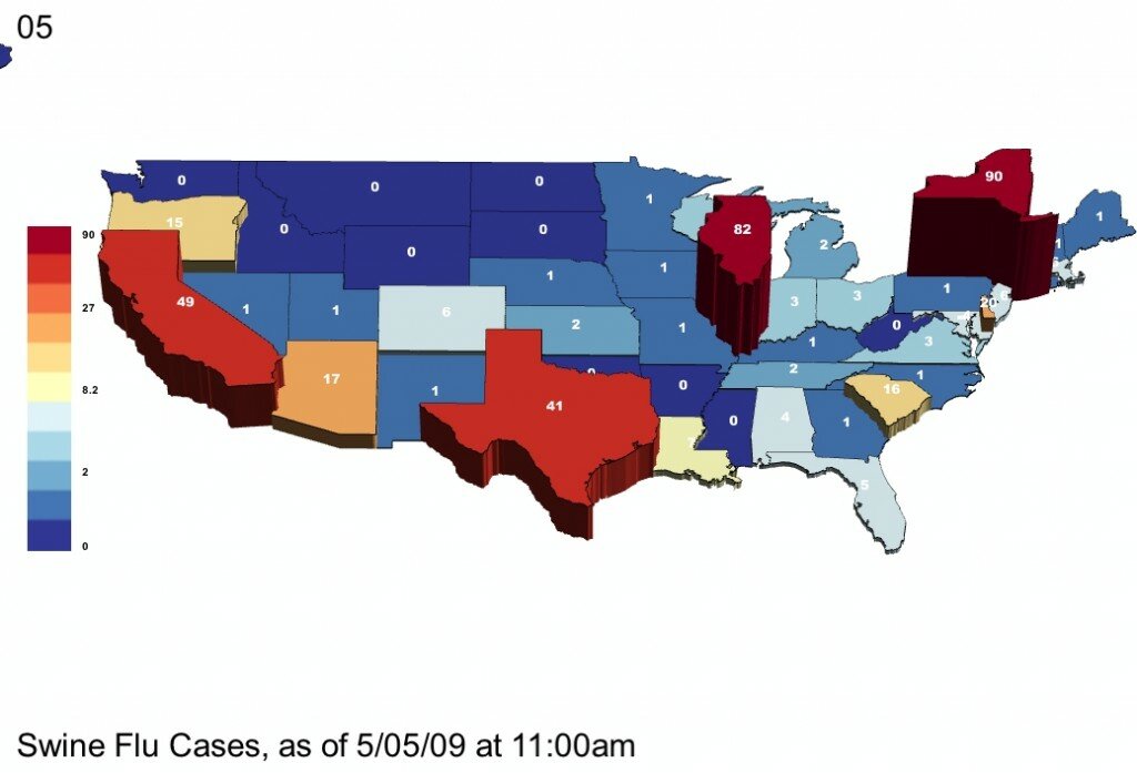
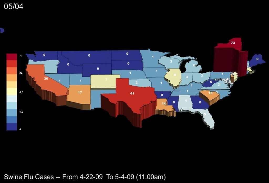
Over the weekend 119 new cases of Swine Flu were reported in the US by the CDC, bringing the count from 160 on Friday to 279 on Monday morning. Note: scroll down for videos of the whole trend, from the first reported cases onward, or search “UUorld” on Vimeo.
To start with, here is an image showing the most recent distribution of cases by state:

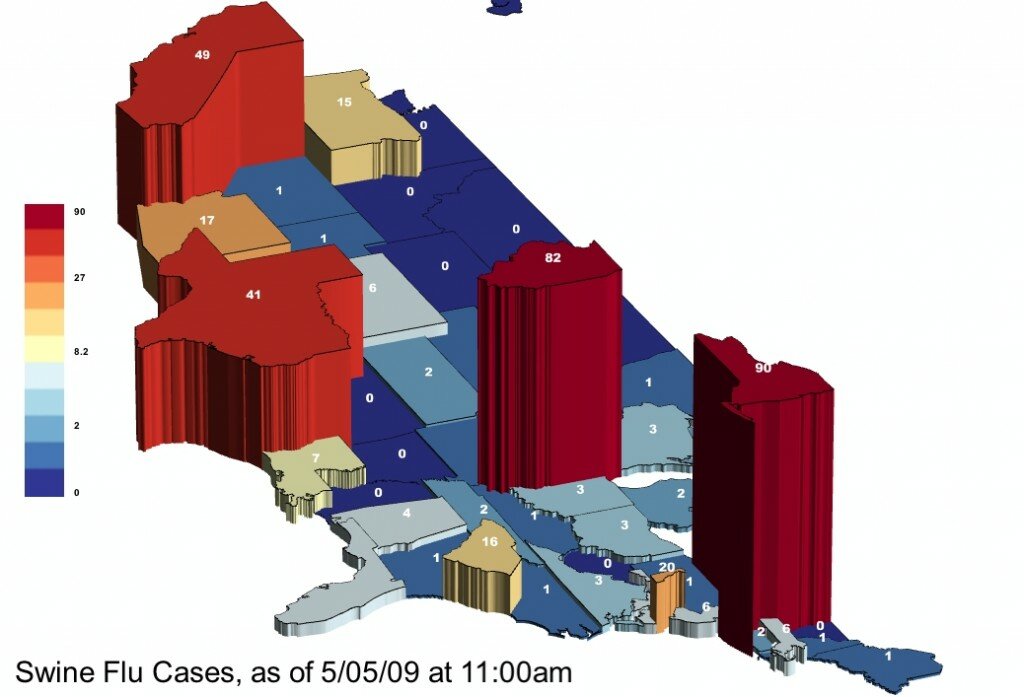
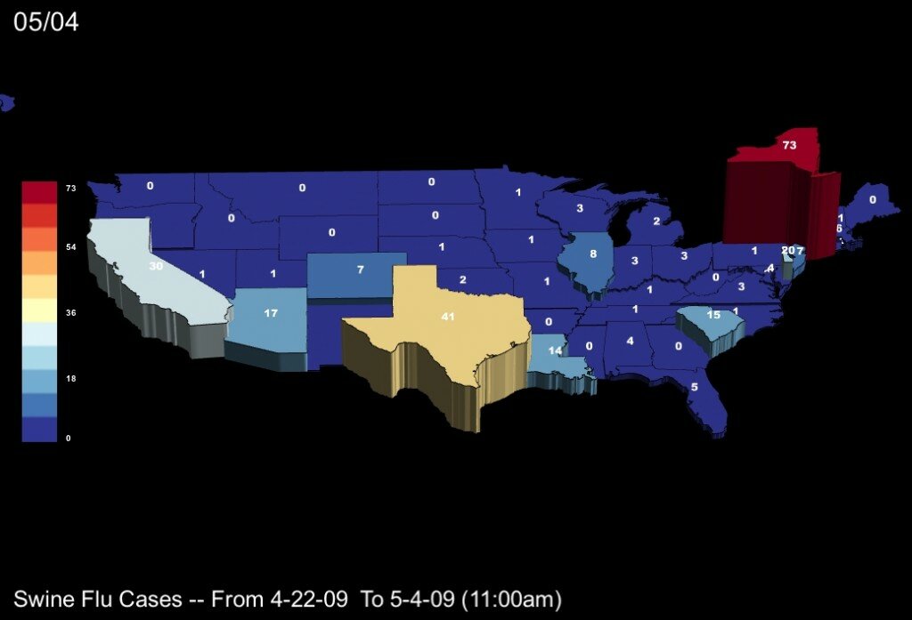
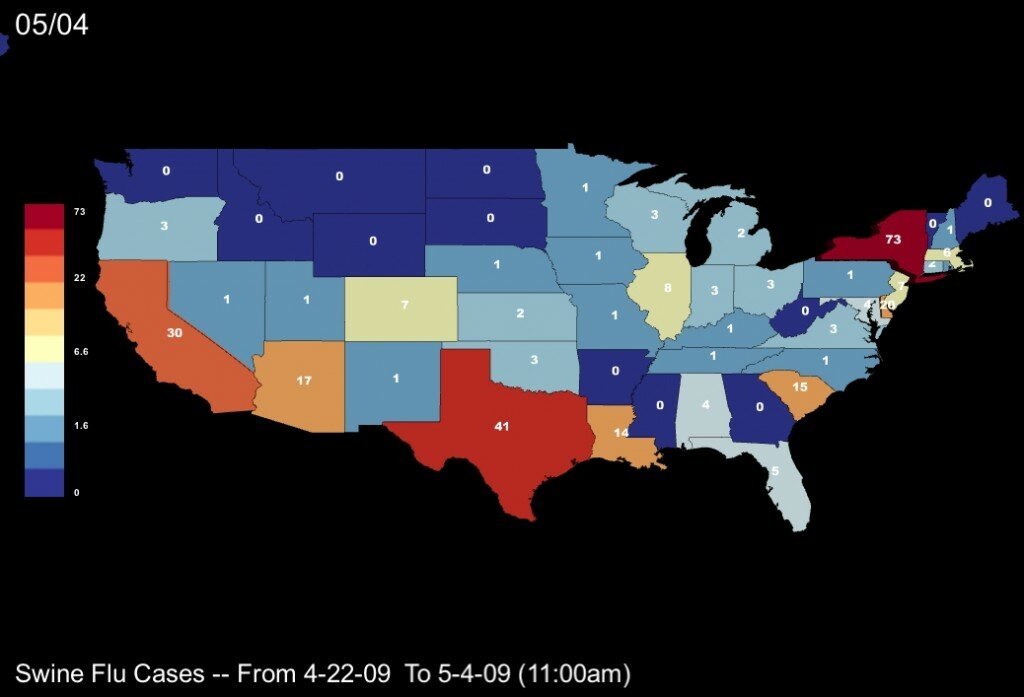
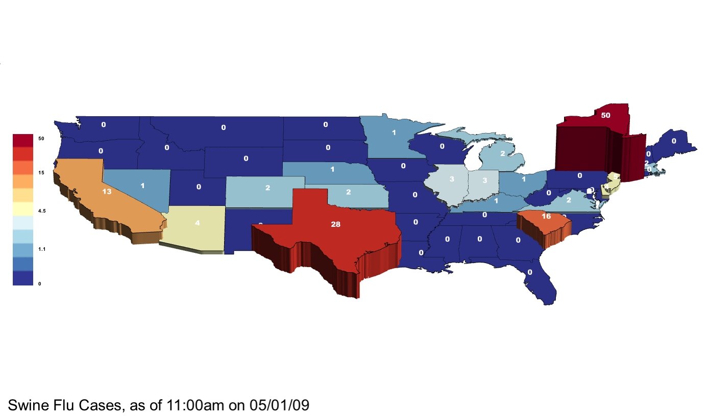
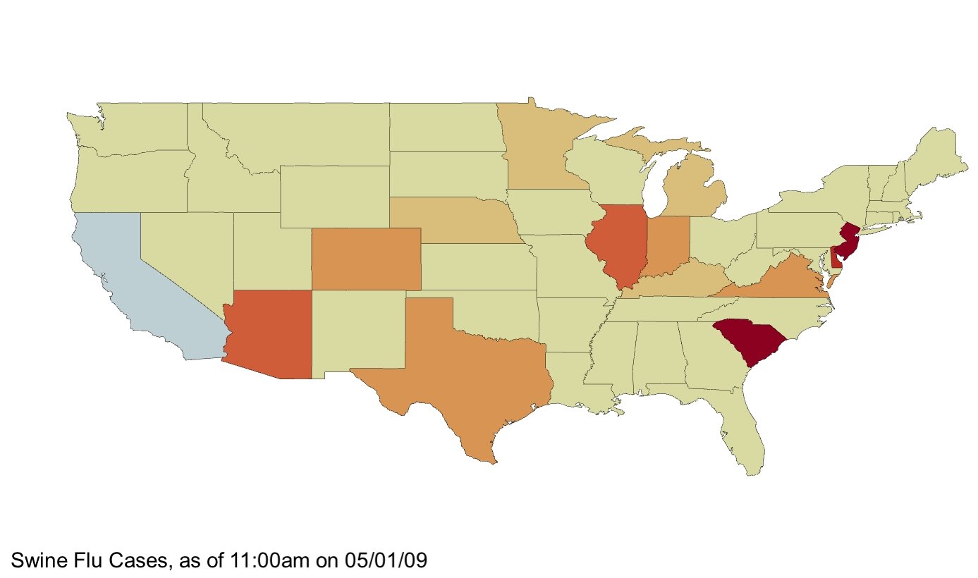
Next is the same data, with colors assigned by a logarithmic scale, so that the breadth of states reporting any cases is emphasized. This scaling may be appropriate if we are concerned to take special note of where the Flu is just beginning to appear. Notice the difference in the color legend. We have this version of the map in both a 3D version and in a flat, colors-only version…

colors by logarithmic scale
Here is a video showing the rise of reported cases from 4/22/09 when no cases had been reported in the US, through 11:00am on 5/4/09…
And a video that shows the same data, with colors by logarithmic scale…
Last, at bottom is a video where colors are by rate of change, such that states with the greatest increase in reported cases appear in dark red and those states with no increase appear in pale yellow. States in blue occur when the number of reported cases decreases, which may happen if an initially reported case cannot be confirmed.
Notice the alternation of high growth in the leading states (CA, TX, NY) with higher rates of increase in a broader group of states (IN, DE, MD, SC, LA, OK, CO). The first cases are reported and growth happens in the leading states, then on 4/30, many other states report increasing numbers, then the leading states are growing fastest again, and last we see a wave of increases coming again from a broader range of states, notably including many new cases in Louisiana and Delaware.
